Two-Frame Films
Luke Fowler-'Two-frame Films' & Serge Eisenstein
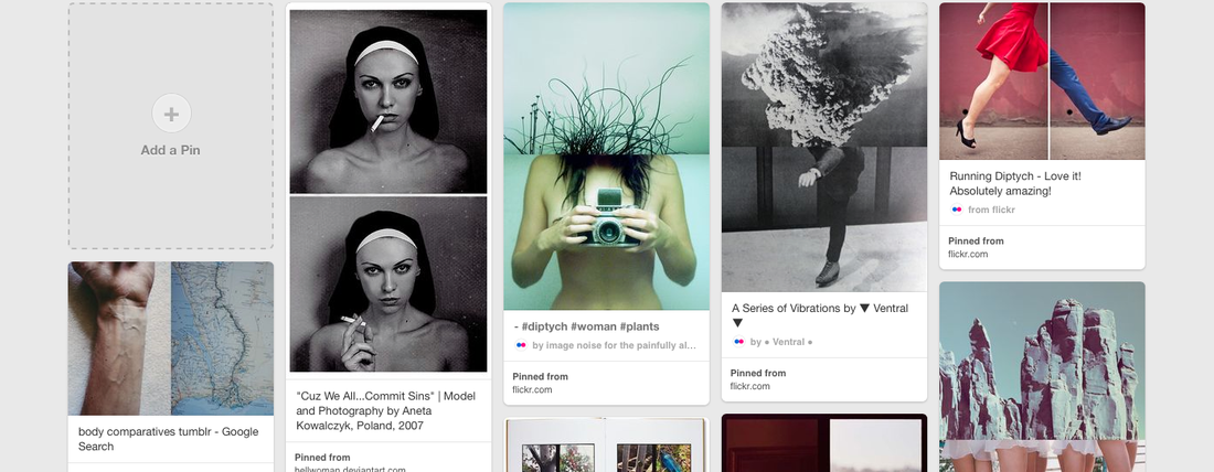
Luke Fowler is an artist and filmmaker, based in Glasgow. The idea of these photographs, comes from the photographer Fowler's series of half-frame photographs, that were published in the book 'Two-Frame Films'. Fowler uses a half-frame camera, which format makes the printing of two images in a standard 35mm frame, and so becomes one image overall, all of the images in his book were taken from the years 2006-2012. The diptychs reference the 'Theory of Montage', by Russian filmmakers in the 1920's, one of these filmmakers was Serge Eisenstein. He believed a montage was 'an idea that derives from the collision between two shots that are independent of one another'.
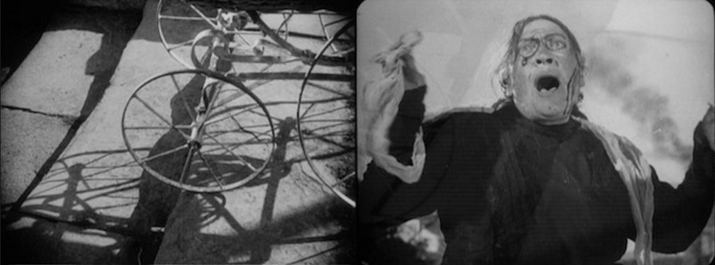
An example of intellectual montage from Sergei Eisenstein's film 'Battleship Potemkin', 1925. I really like tis two-frame film, because it shows an event and the reaction.
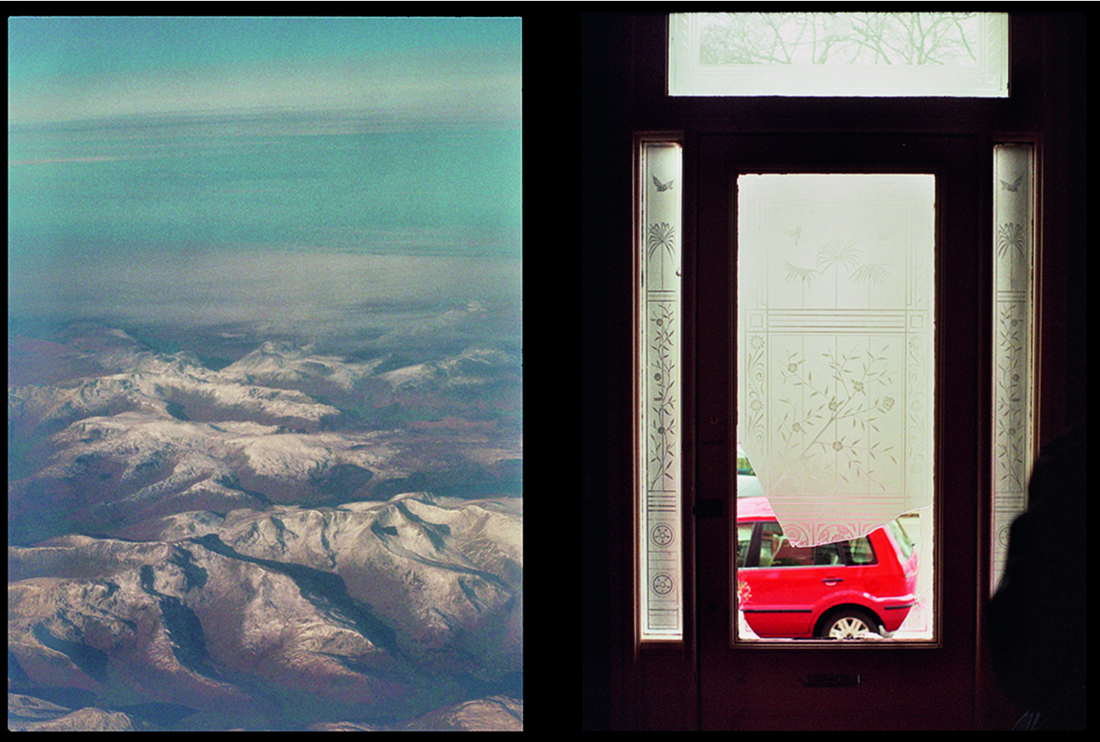
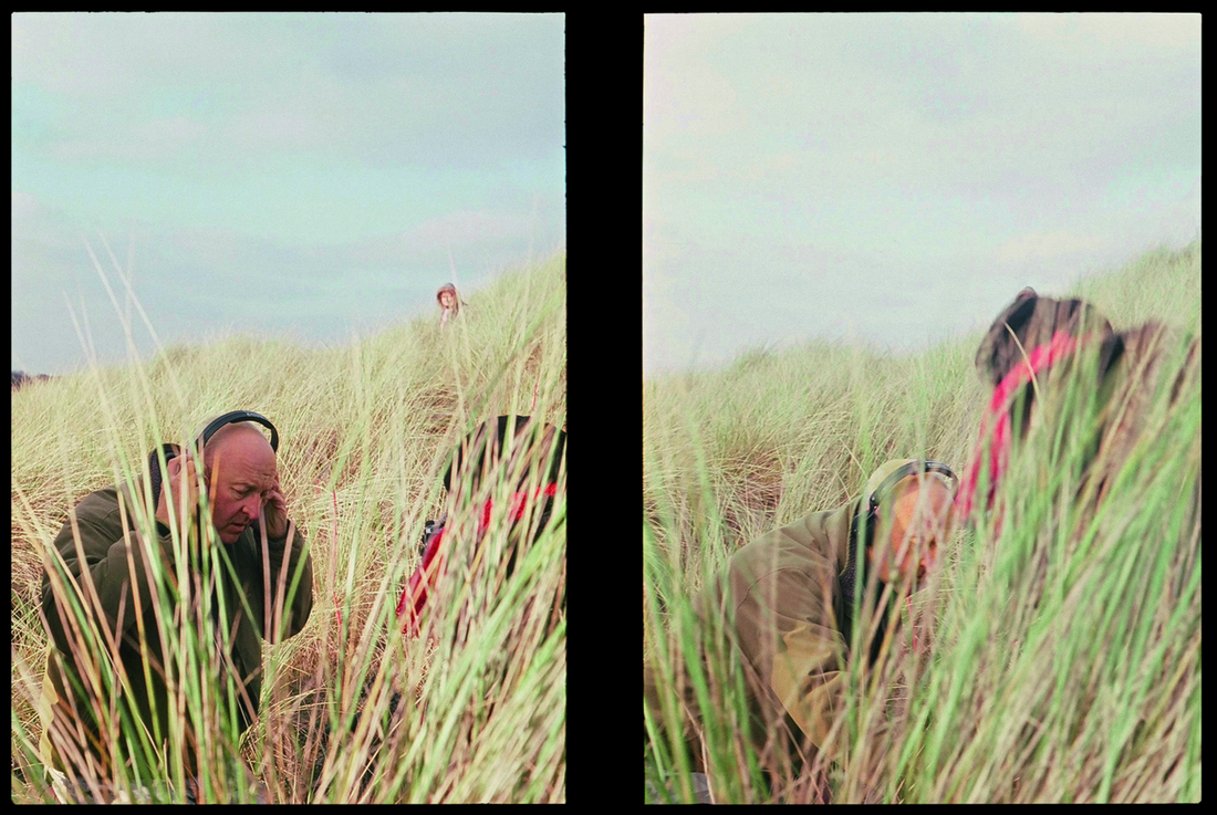
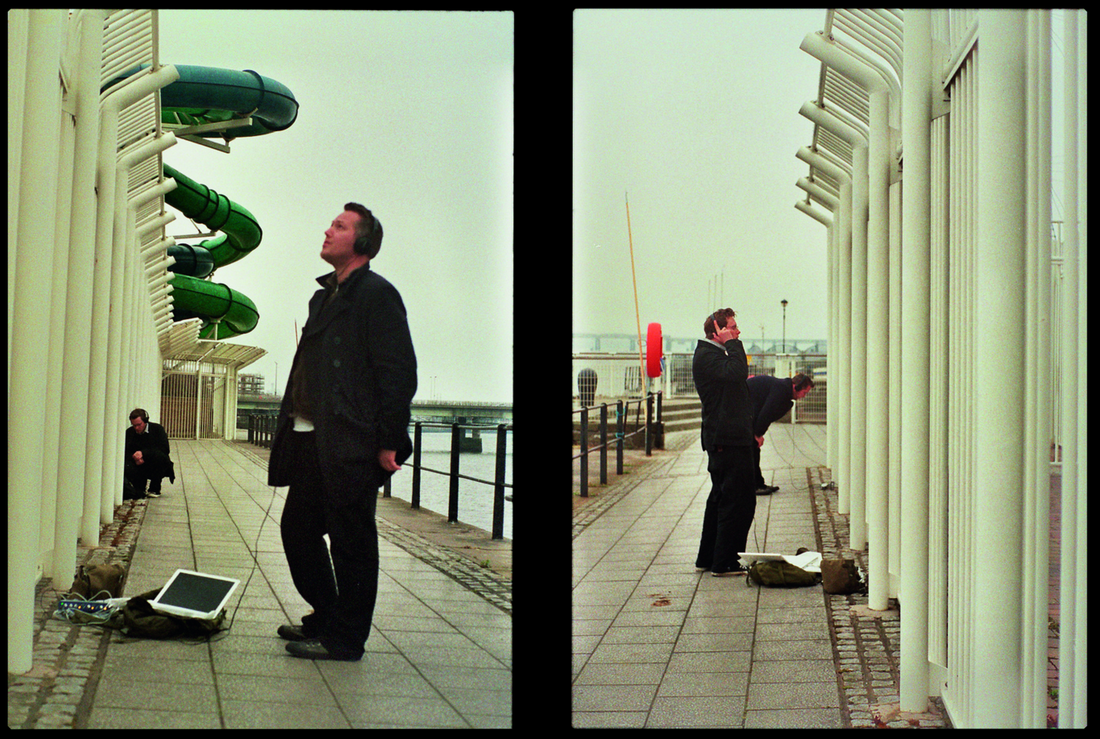
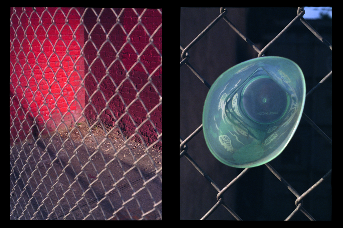
Here are a few examples of Luke fowlers work from his book 'Two-Frame Films'. Fowler links his images together by; the location of them, time they were taken, viewpoint or by the context of the image. It's clear that in some of his images, he has thought about how to relate the two pictures together, where as in some of his diptychs, they are completely unrelated.
Response
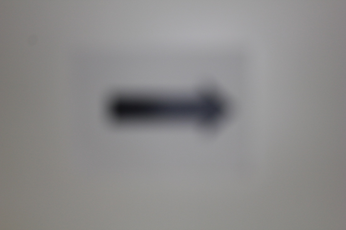
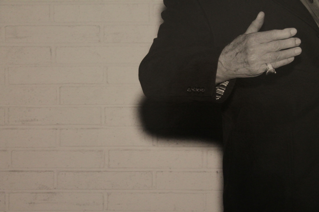
I think these two images work really well together, as diptychs. This is because in the first image, the blurry arrow is pointing right, and in the second image, the mans hand is pointing right. Not only do the shapes in the images link together, but the shadow from the mans arm looks quite like the arrow again, as it is back and blurry. Another link between these images, is that they are both in black and white, which is an obvious similarity.
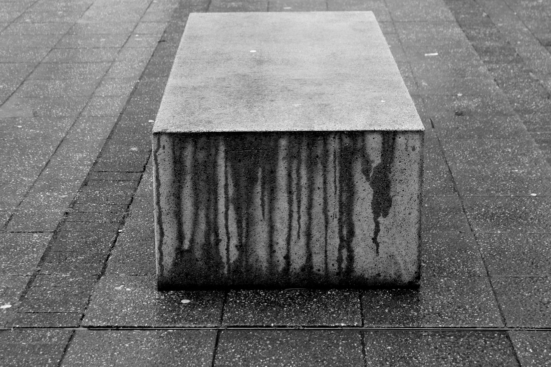
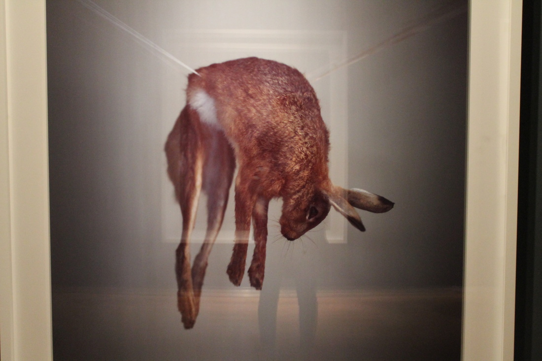
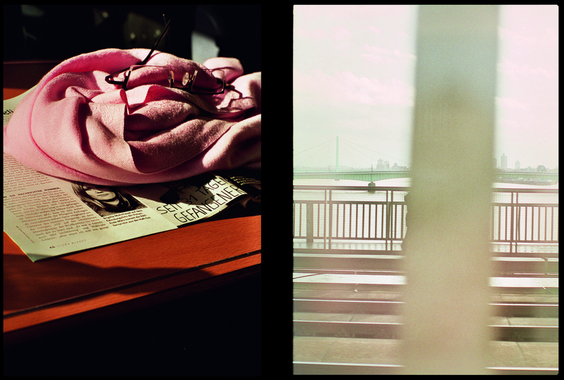
I thought these two images can go together, from the similar shapes in them. When I see these images next to each other I think of the dead rabbits lifeless legs, as the water, that has dribbled down the side of the bench, creating dark streaks. I didn't edit the image of the rabbit to be in black and white, as I liked the clear distinction between a man-made object and animal.

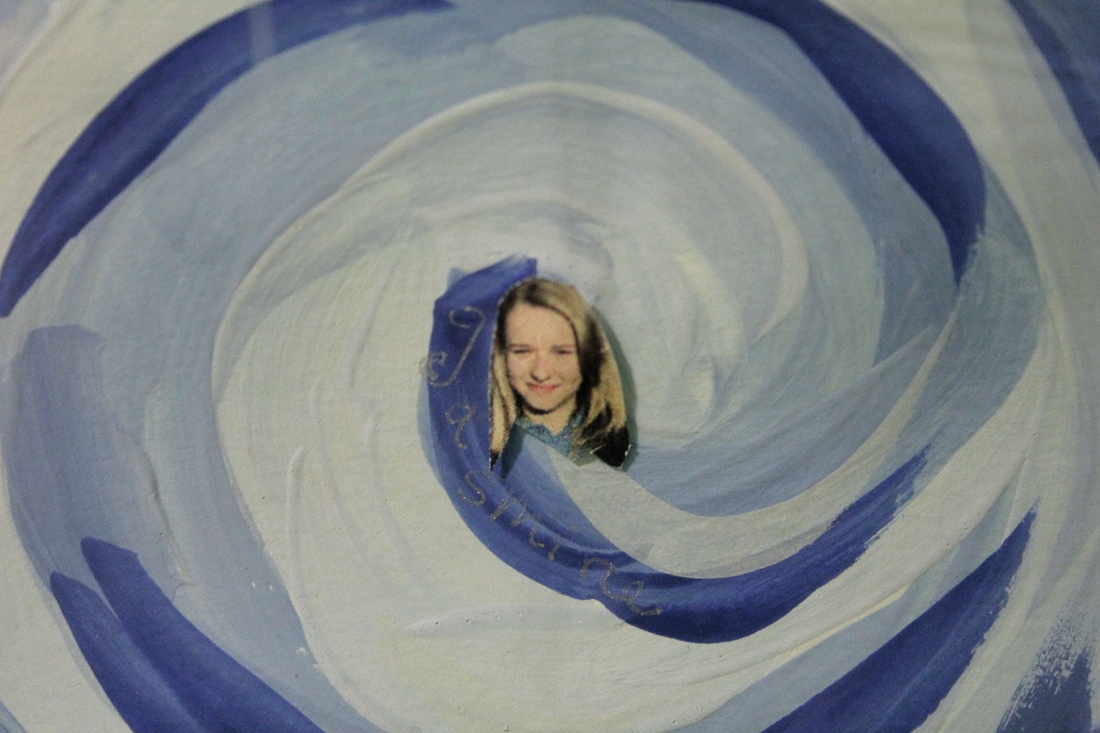
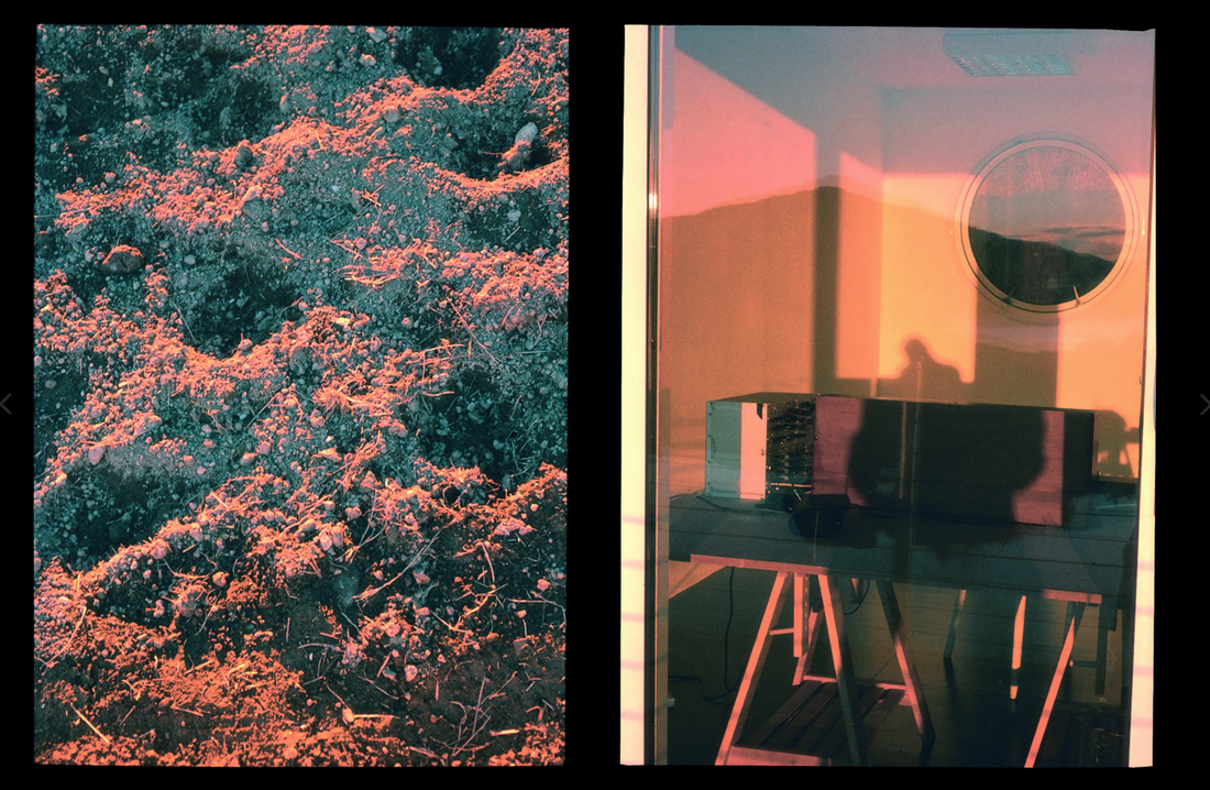
I picked these two images to create a diptych, because of the colours used. The main focus in both of these colours is white and blue. In the first image the focus is on the girls dress, where as in the second one, its the painting surrounding the photo of the girls head. I edited the second image, to follow the colour tone in the first one more, as originally, it was slightly yellow. I edited it on iPhoto, and used the fade effect and increased the exposure and contrast slightly, to move the focus towards the painting.
Display Strategies
If I could present my diptych book in any way I could, I think I would want all of my pieces of work in the same room. I think I would want some images to be printed onto large pieces of glass, about the height of a person, that were in a 3D rentangle and about 7 were dotted around the room. On each rectangle there would only be two images, so if someone was looking from one side straight on, the images wouldn't be overlapping. However I think it would be effective if on a couple the images did overlap, to show even more the images. The whole room would have quite bright lighting, which would make it easier to see. I think this would be an effective way to show that all the images are linked together somehow, instead of being side by side and not being attached just by the images, but by physical objects (glass).
