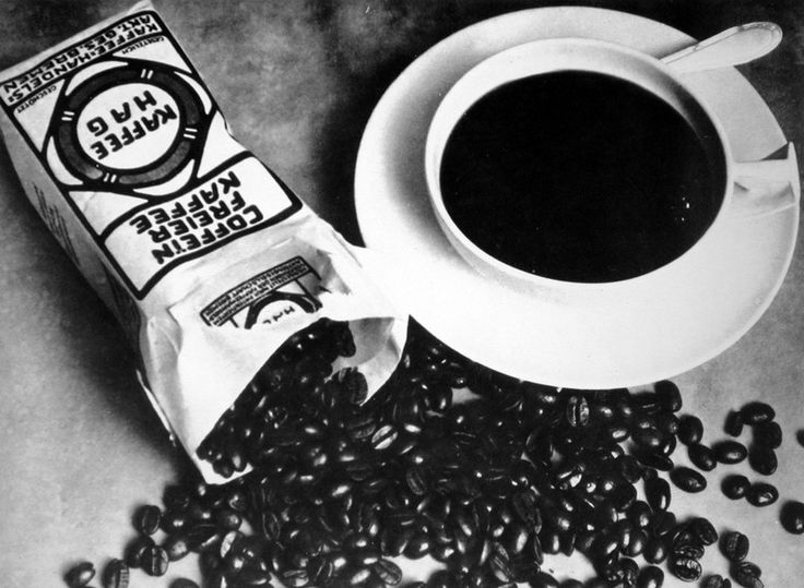
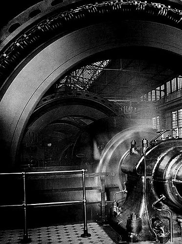
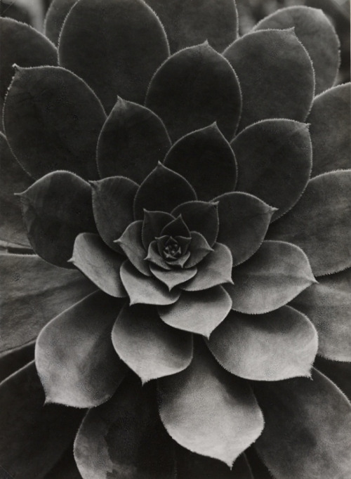
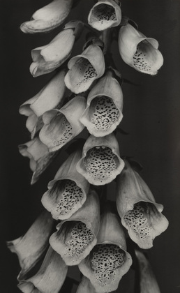
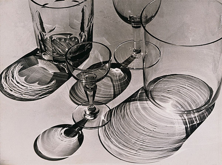
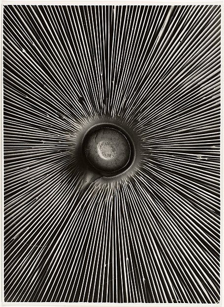
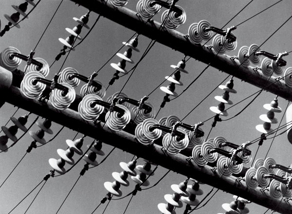
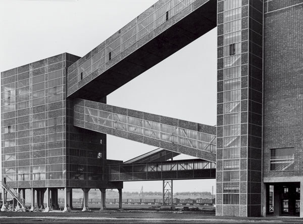
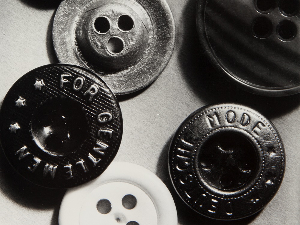
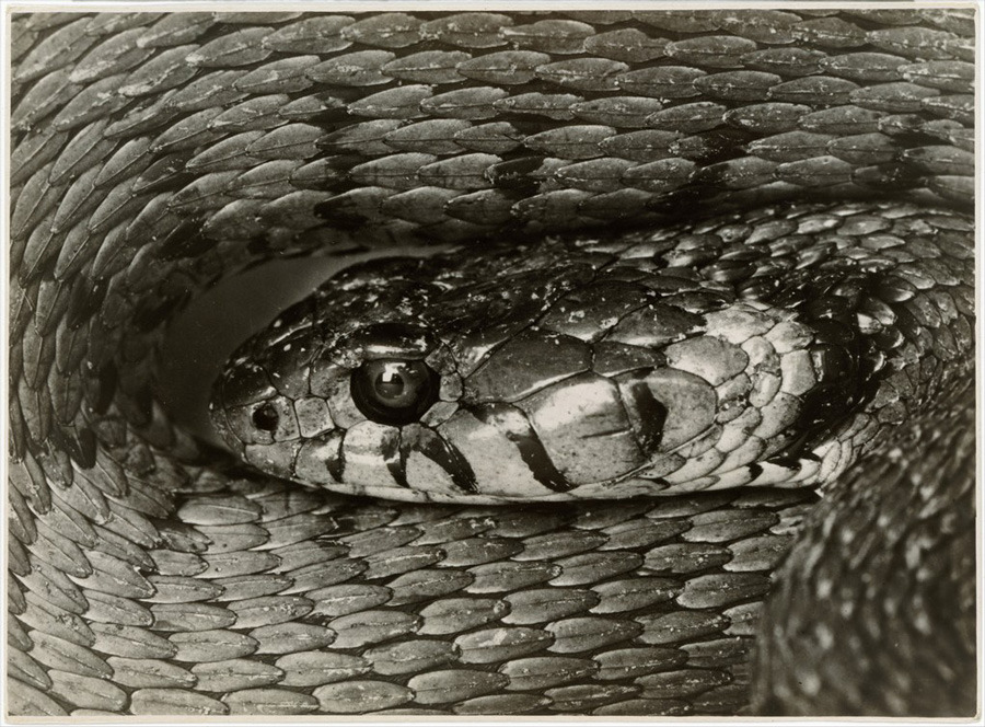
Albert Renger-Patzsch - The World is Beautiful
Albert Renger-Patzsch was a German photographer, who first became interested with photography at the age of 12. He has always liked to photograph things that were geometric and with lots of different shapes, as well as this he also enjoyed taking pictures of organic things, such as trees. He was associated with the New Objectivity. The New Objectivity was a group of artists in the 1920's, which were portrayed in a realistic style. The term 'Neue Sachlichkeit' was the title these photographers where known as, which was created by in 1925 by Gustav Hartlaub. It focuses on rejecting sentimentality and idealism as well as seeing and representing things, exactly the way they are. Albert Renger-Patzsch made it images, based around the New Objectivy. In 1928 he created a book called 'The World is Beautiful' which was a collection of 100 photographs which portrayed both the sides or nature and industry. Similar photographer at the time were; Karl Blossfeldt, Laszlo Moholy-Nagy, August Sander, Helmar Lerski and Edward Weston

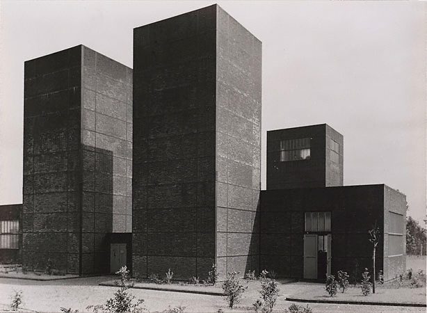
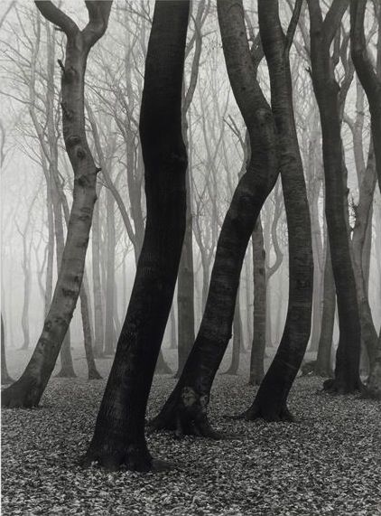
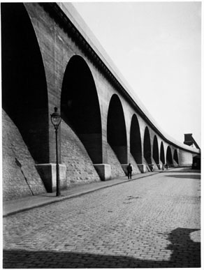
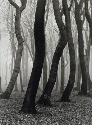
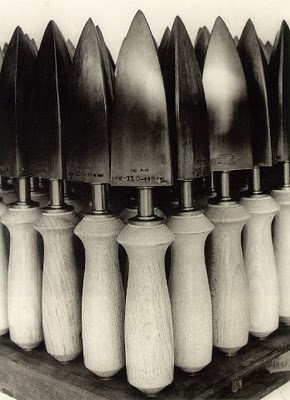
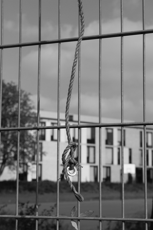
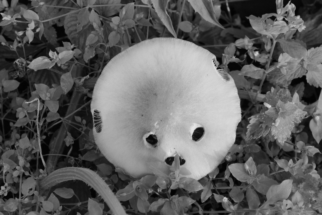
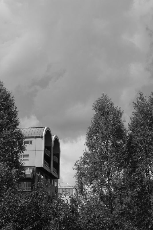
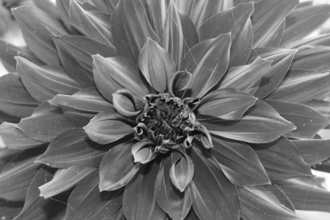
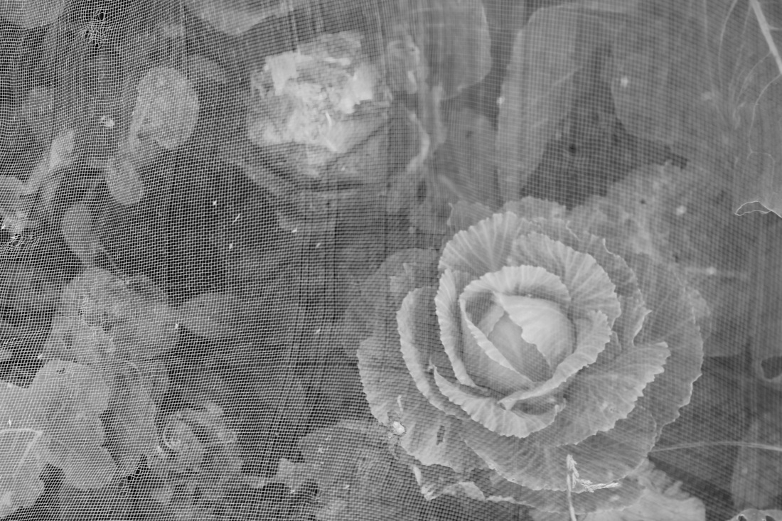
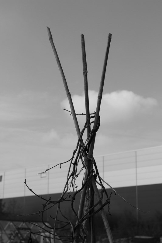
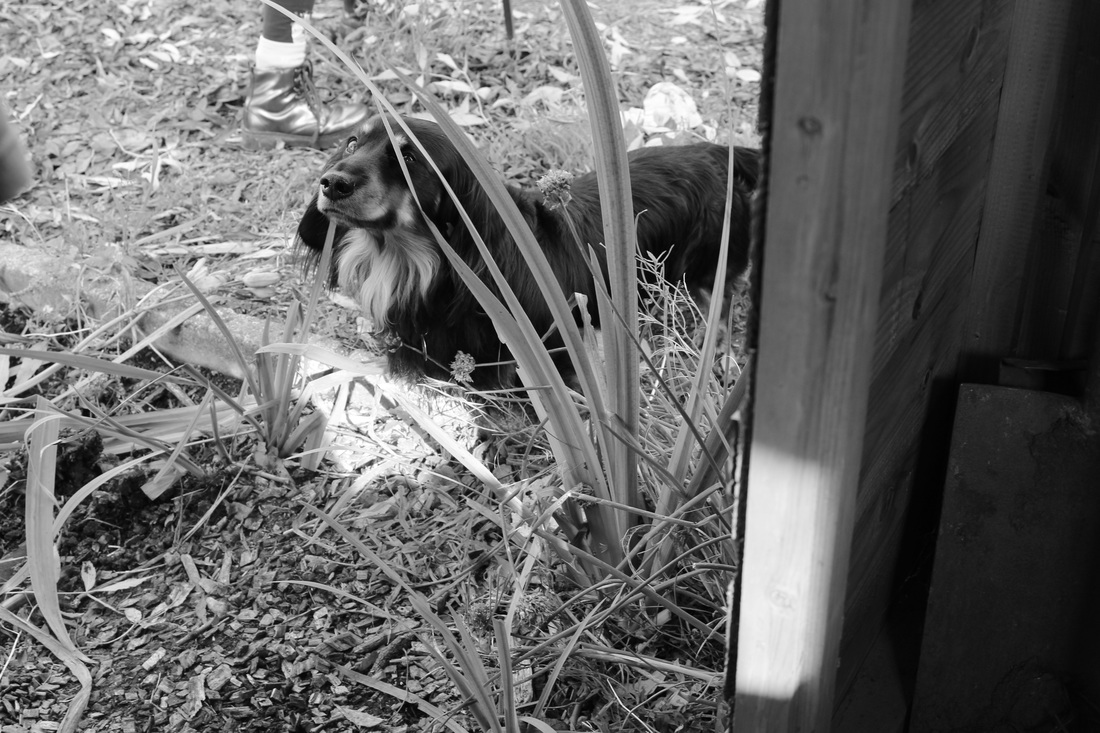
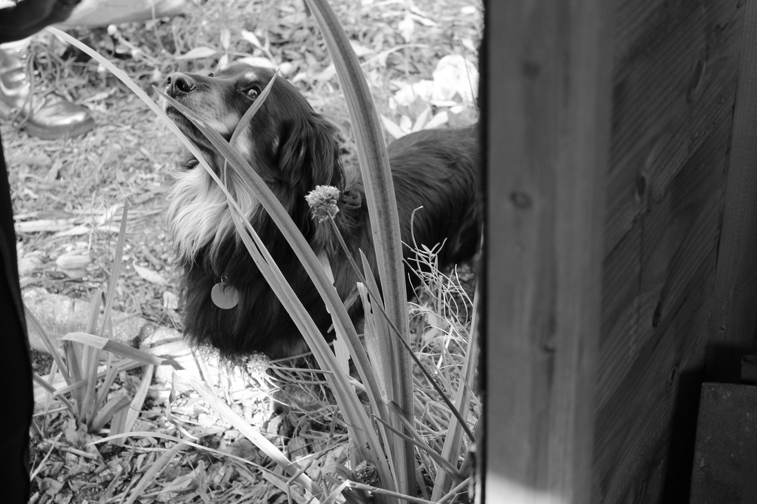
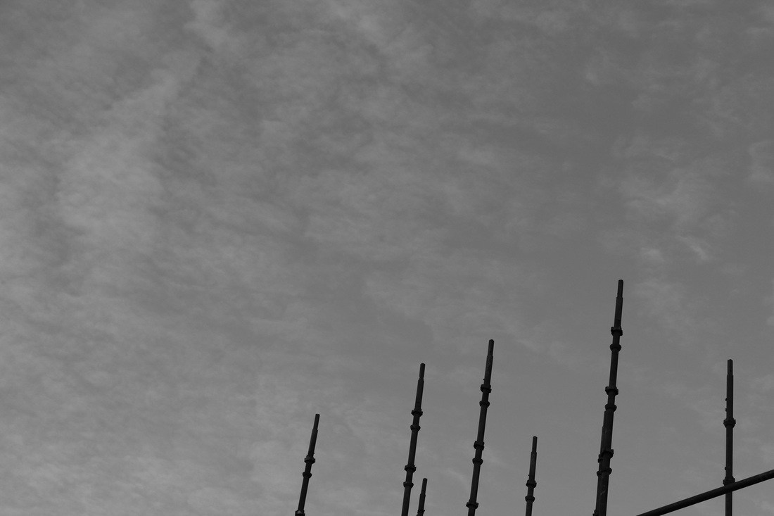
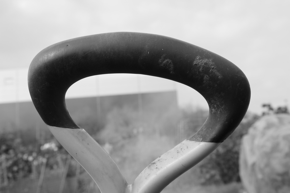
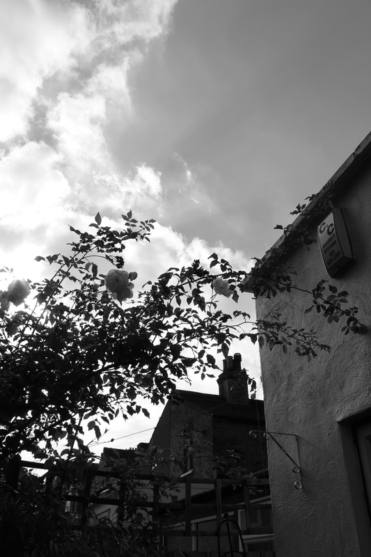
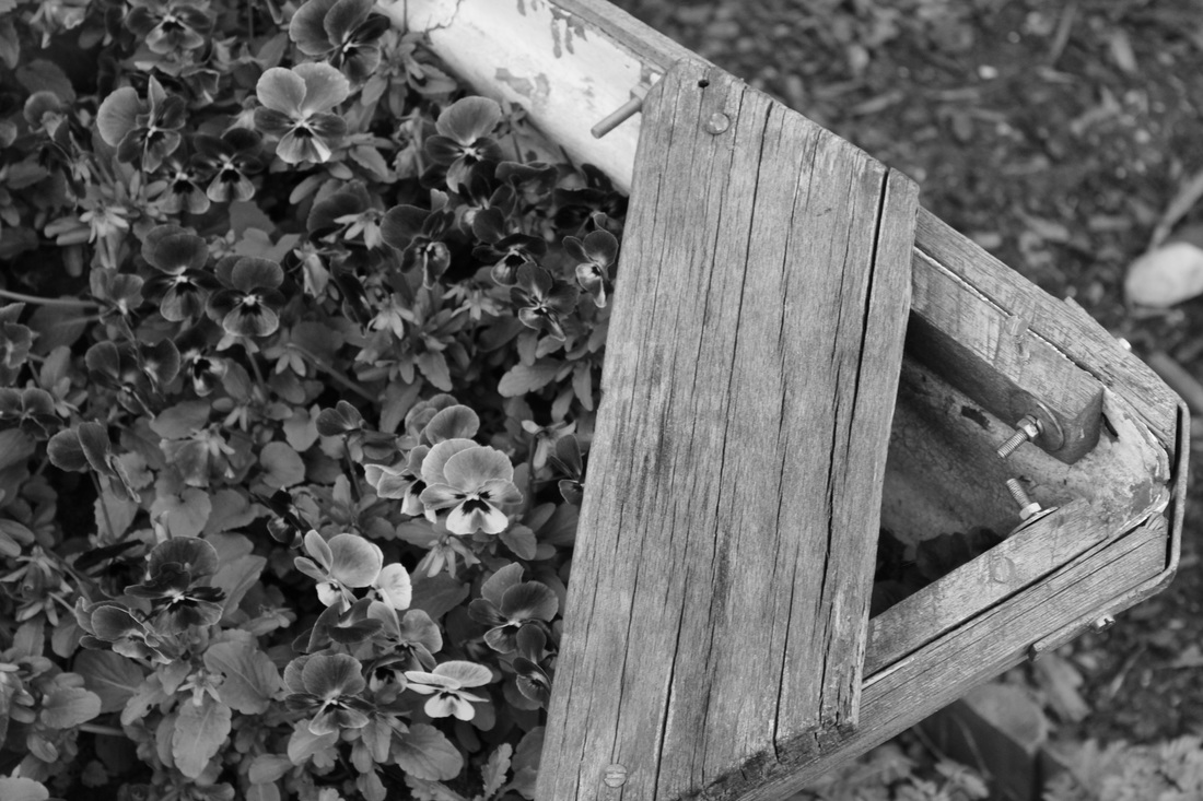
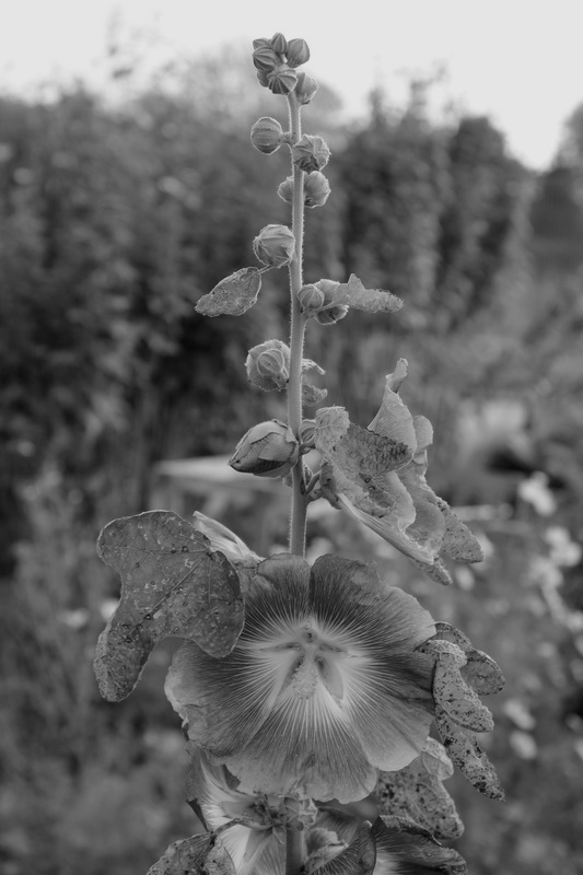
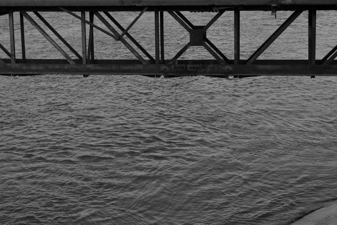
Organic vs Geometric
|
|
Both of these images contrast one another, for example the there is a clear distinction between natural and man made. This is shown by the trees and ground, which is contrasted by the the shovels. The way the trees have been formed and they way they lean are all organic, where as the spades are all lined up in specific places to form a square shape, this shows the differences between how each image has been formed.
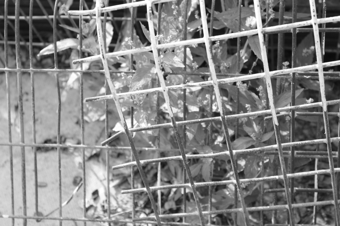
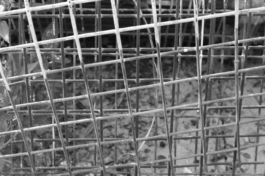
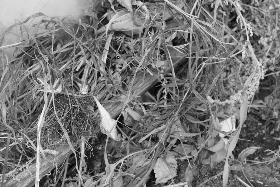
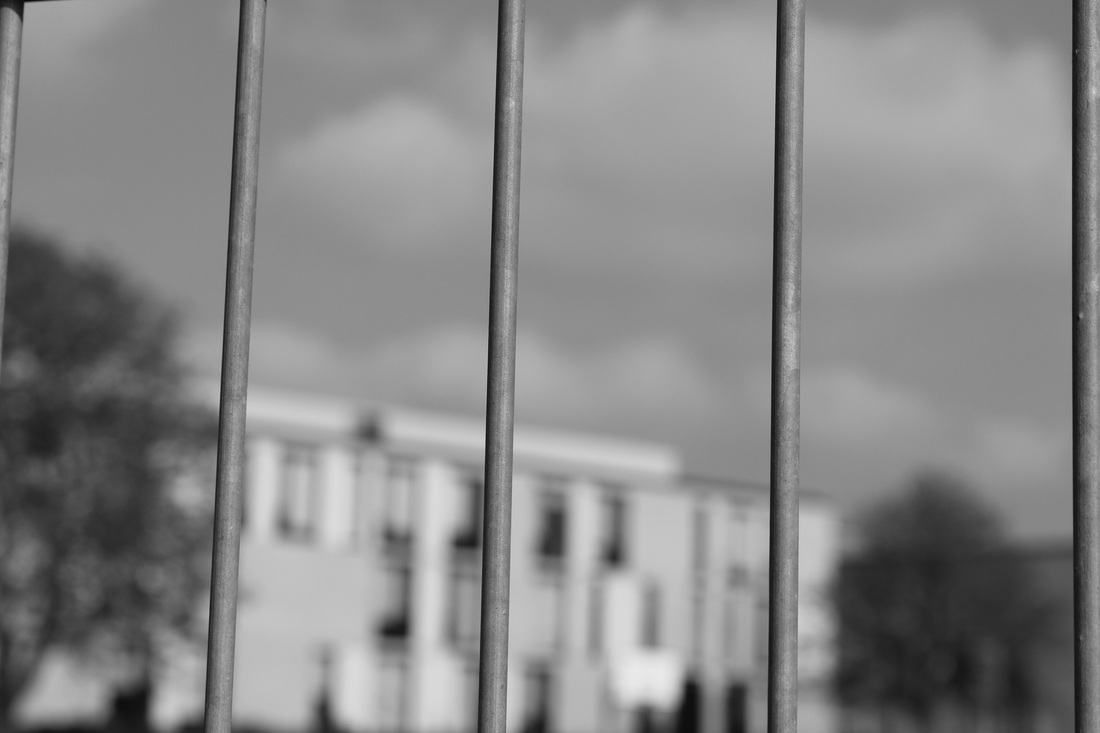
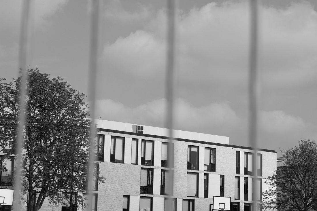
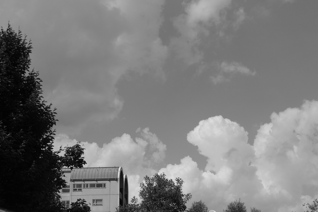
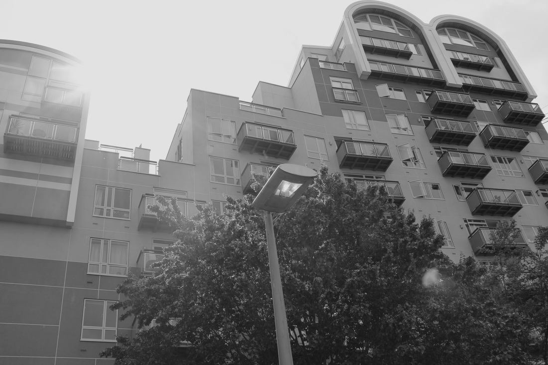
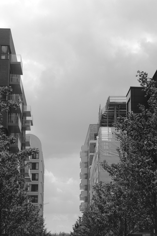
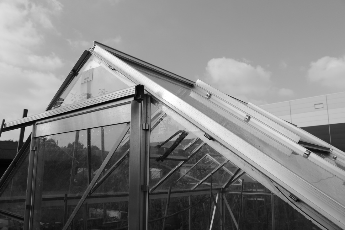
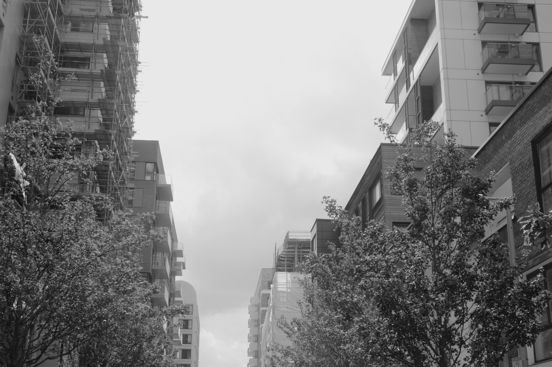
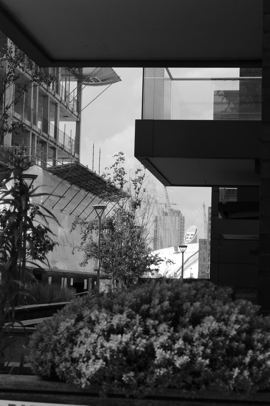
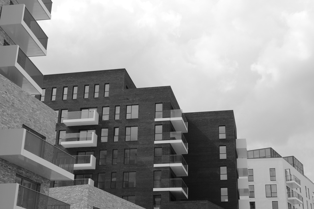
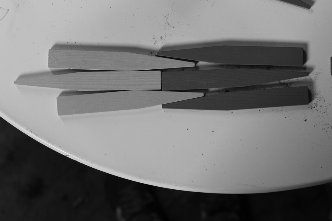
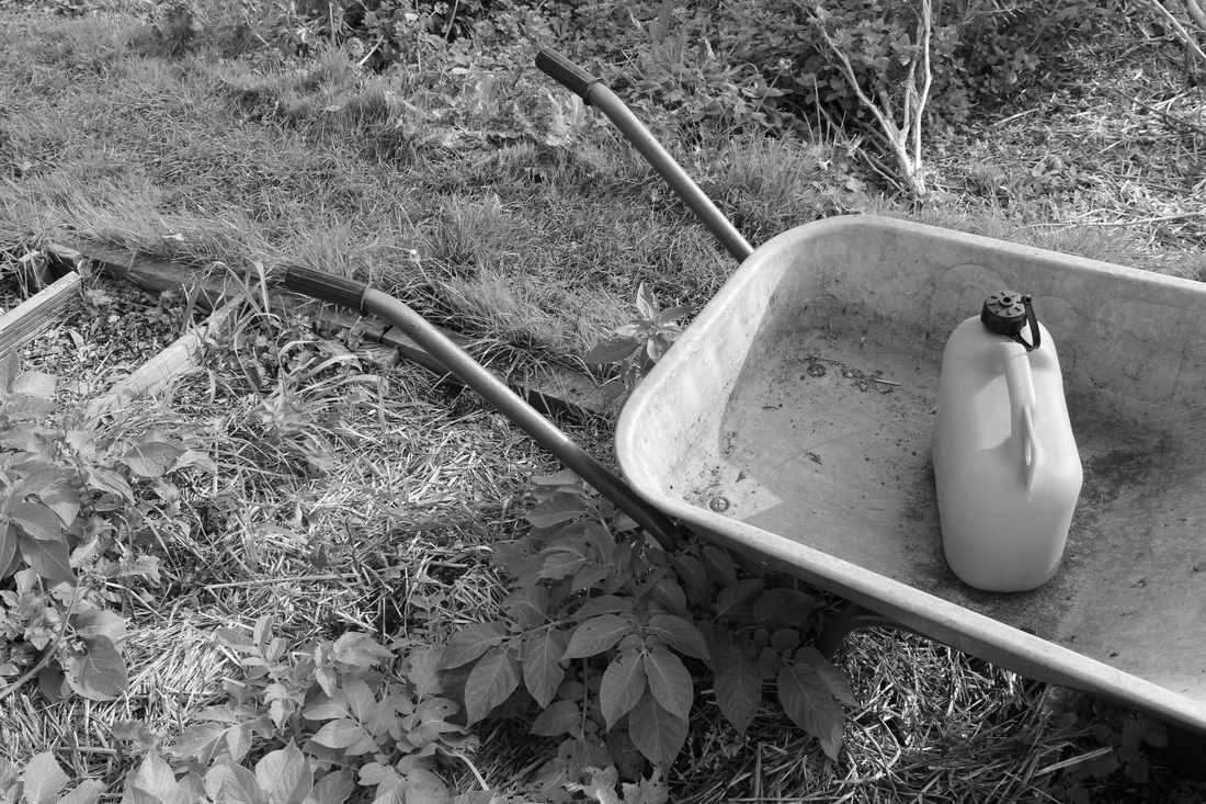
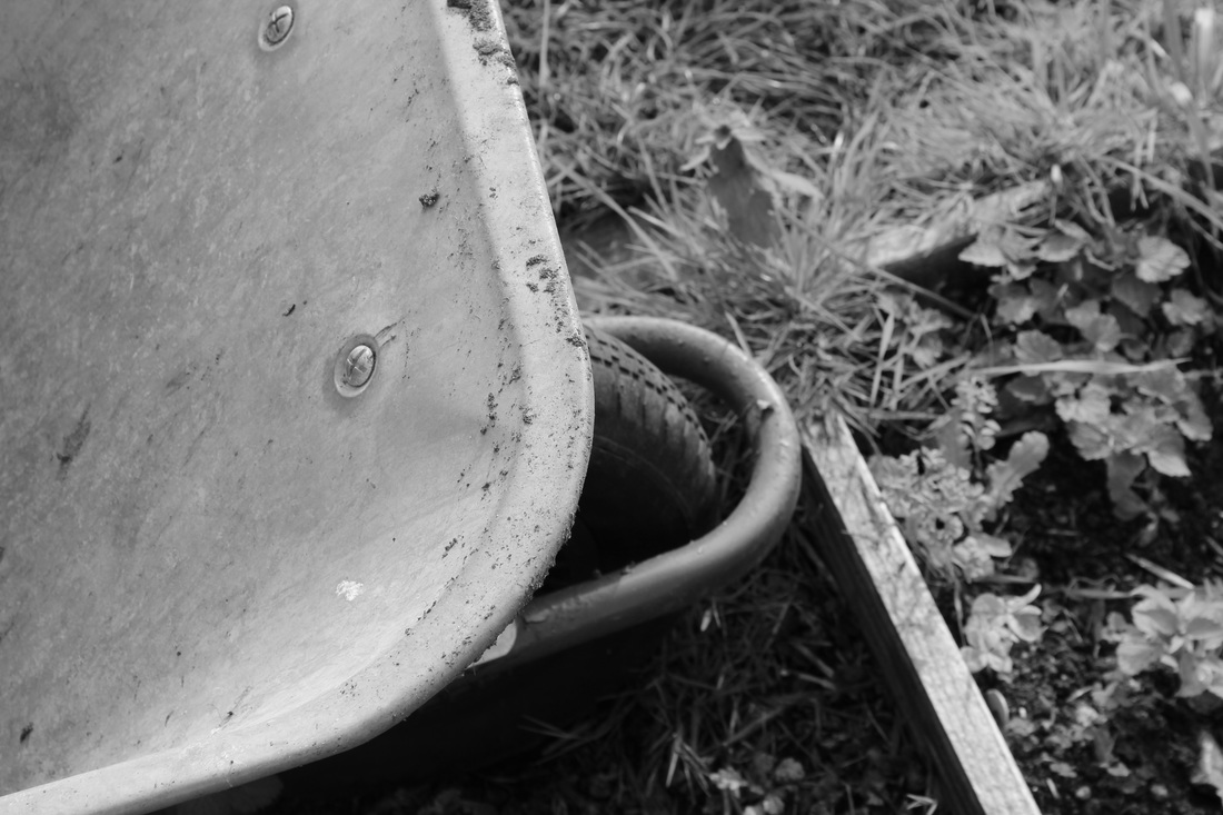
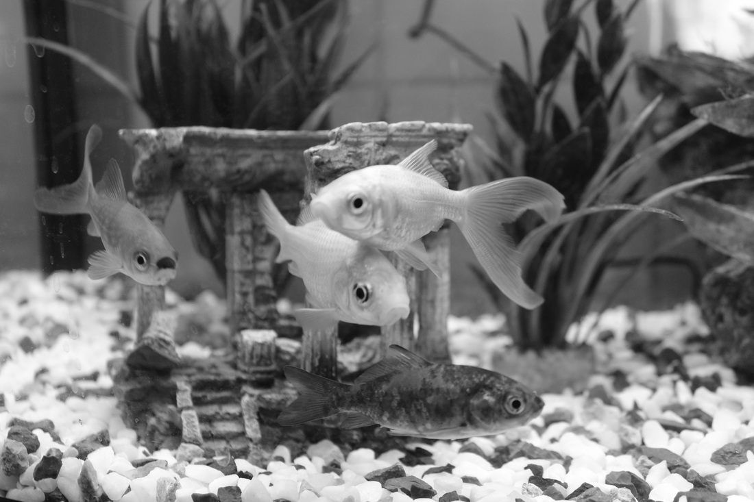
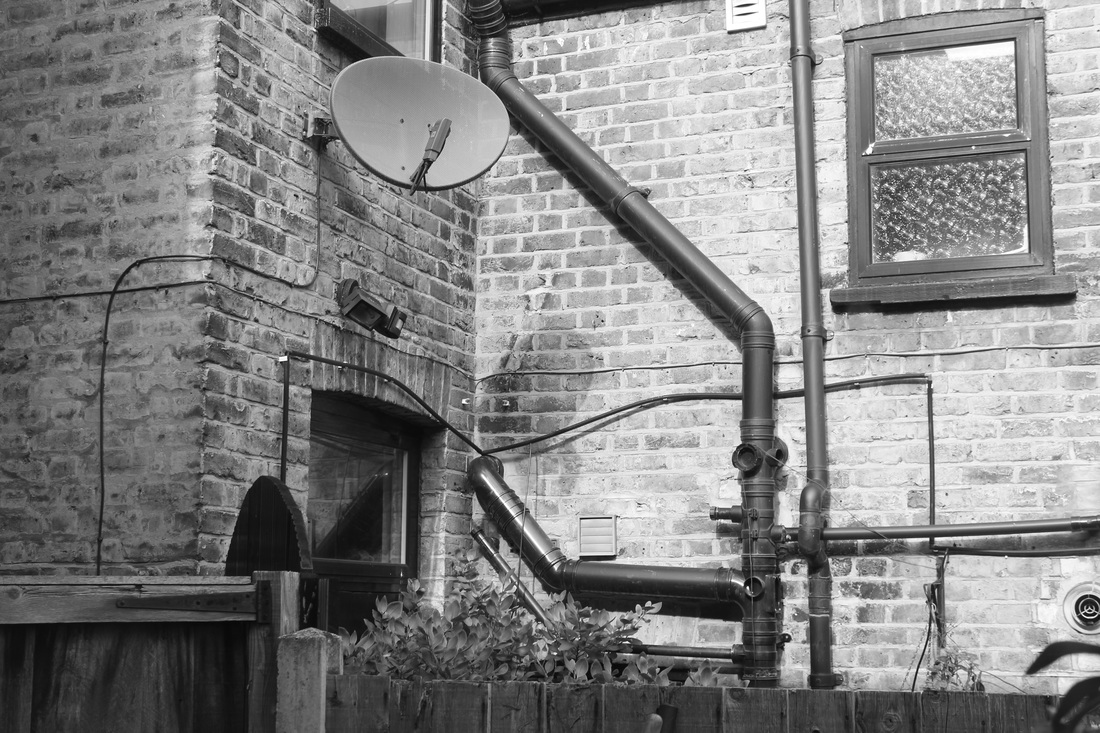
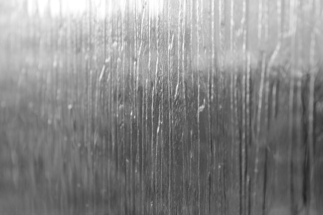
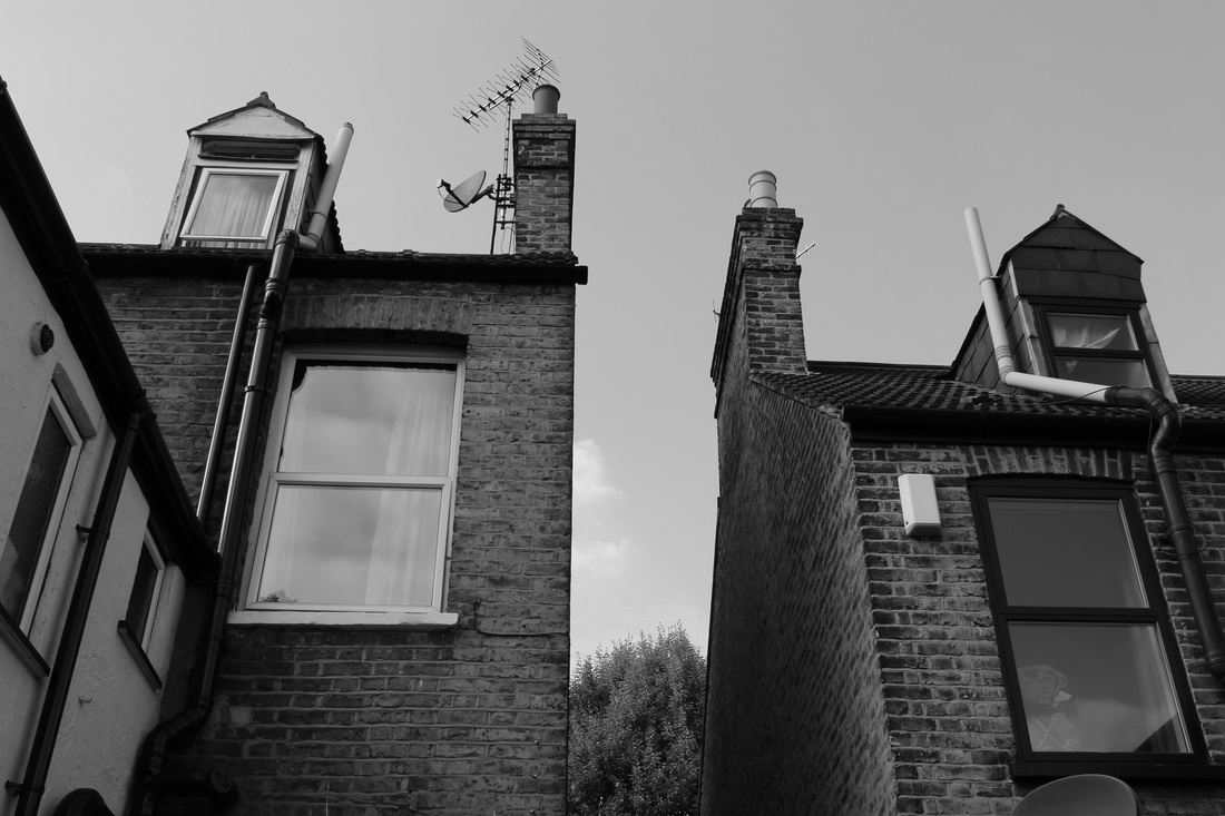
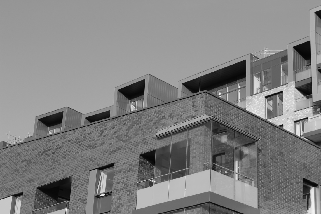
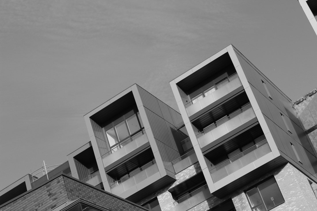
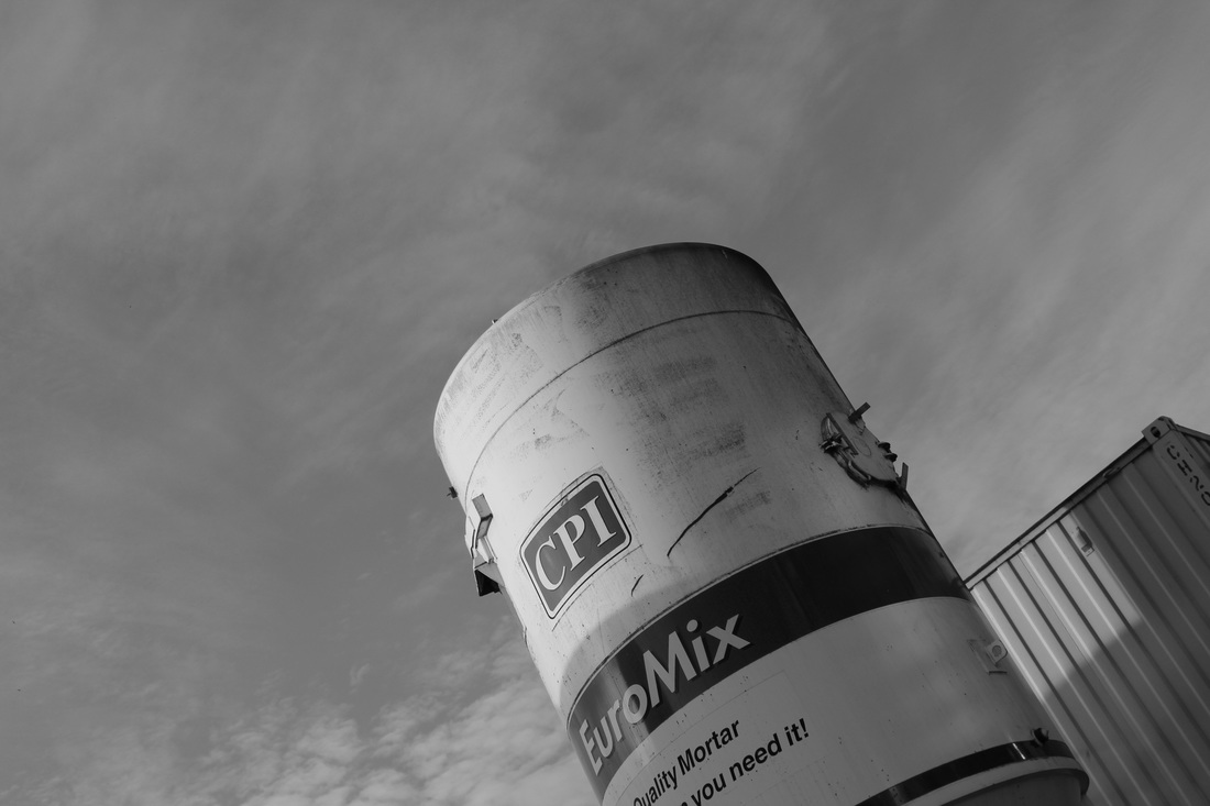
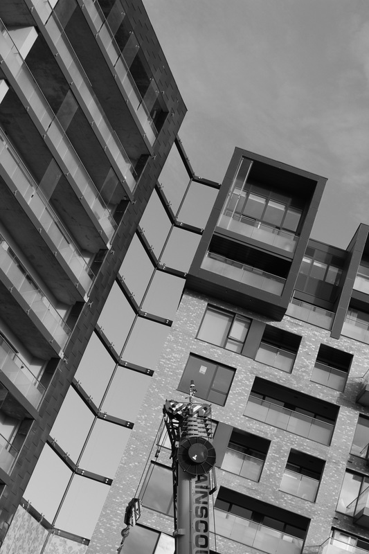
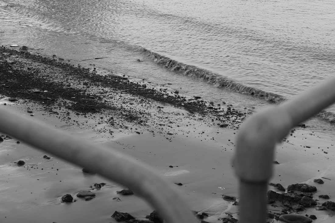
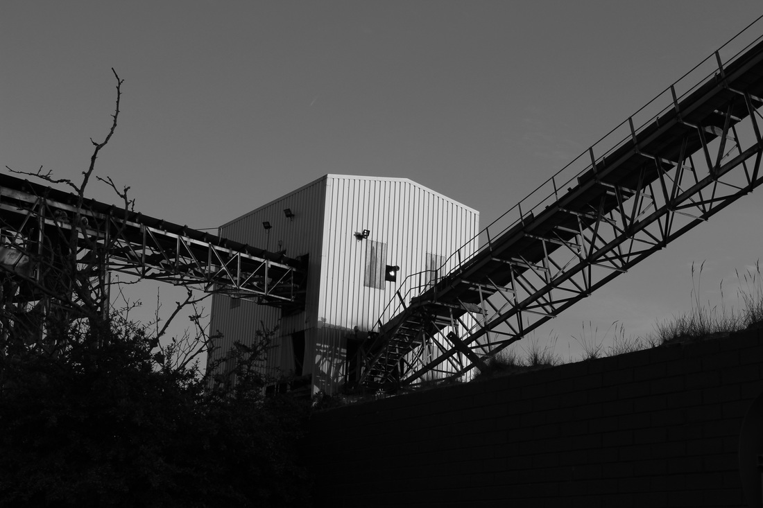
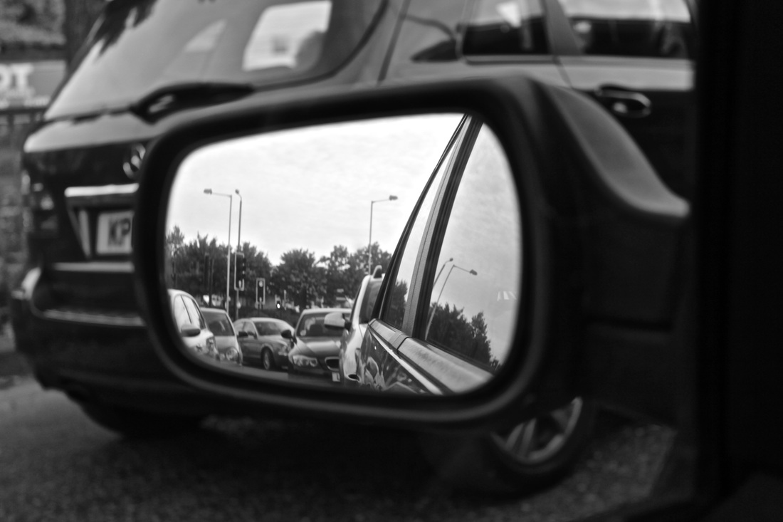
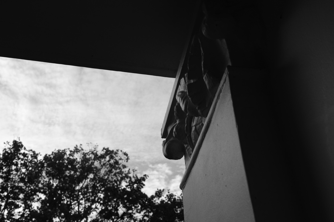
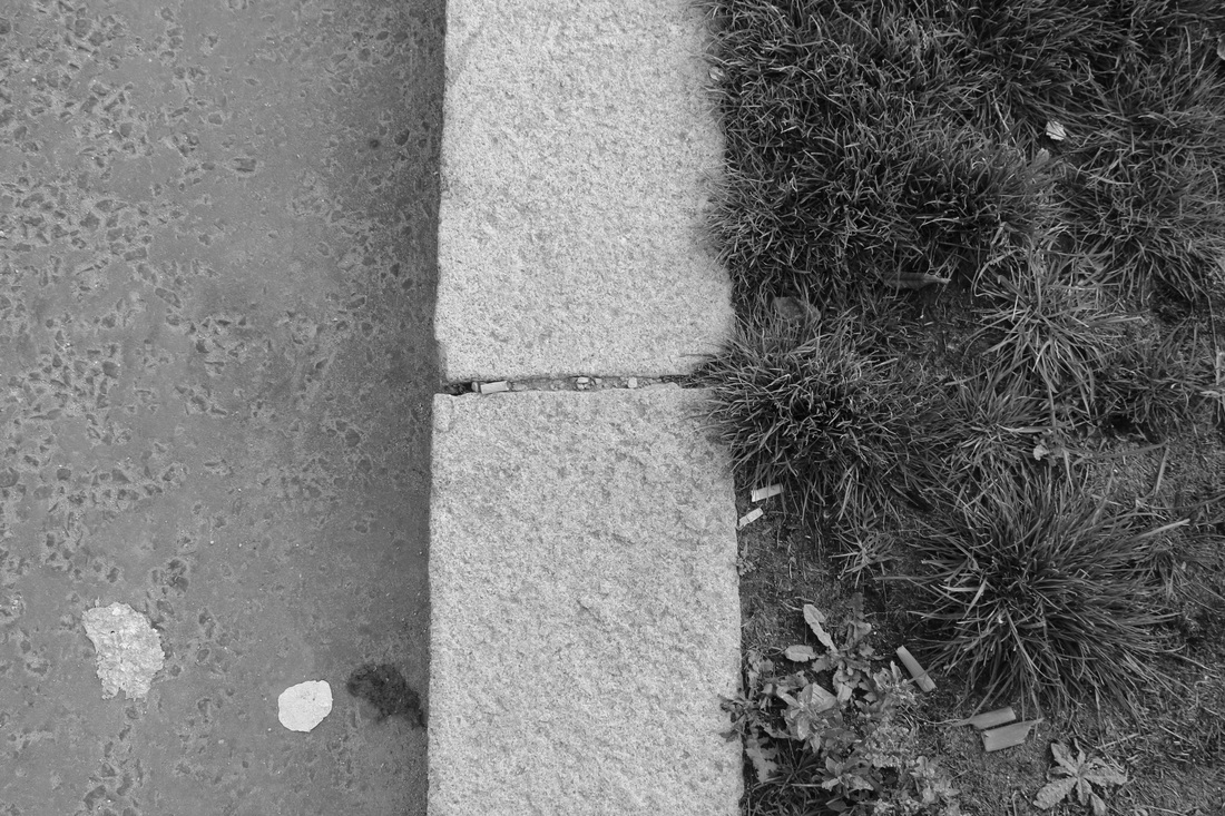
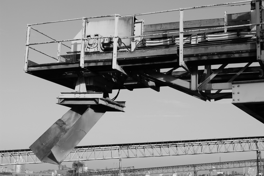
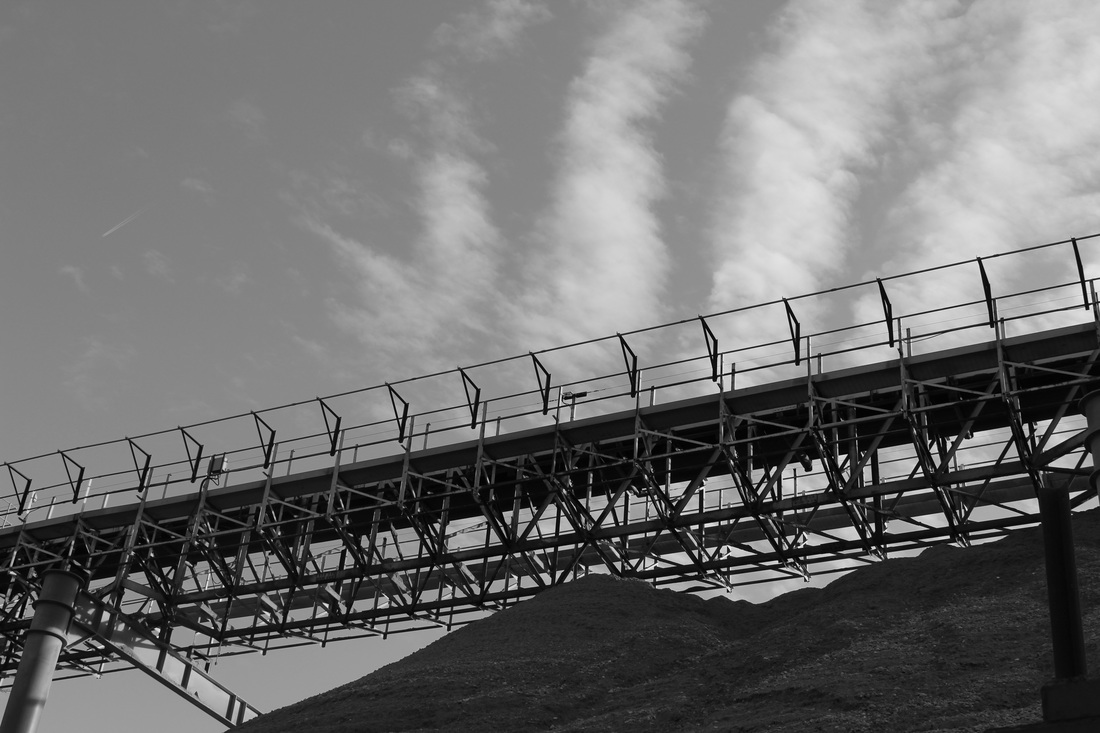
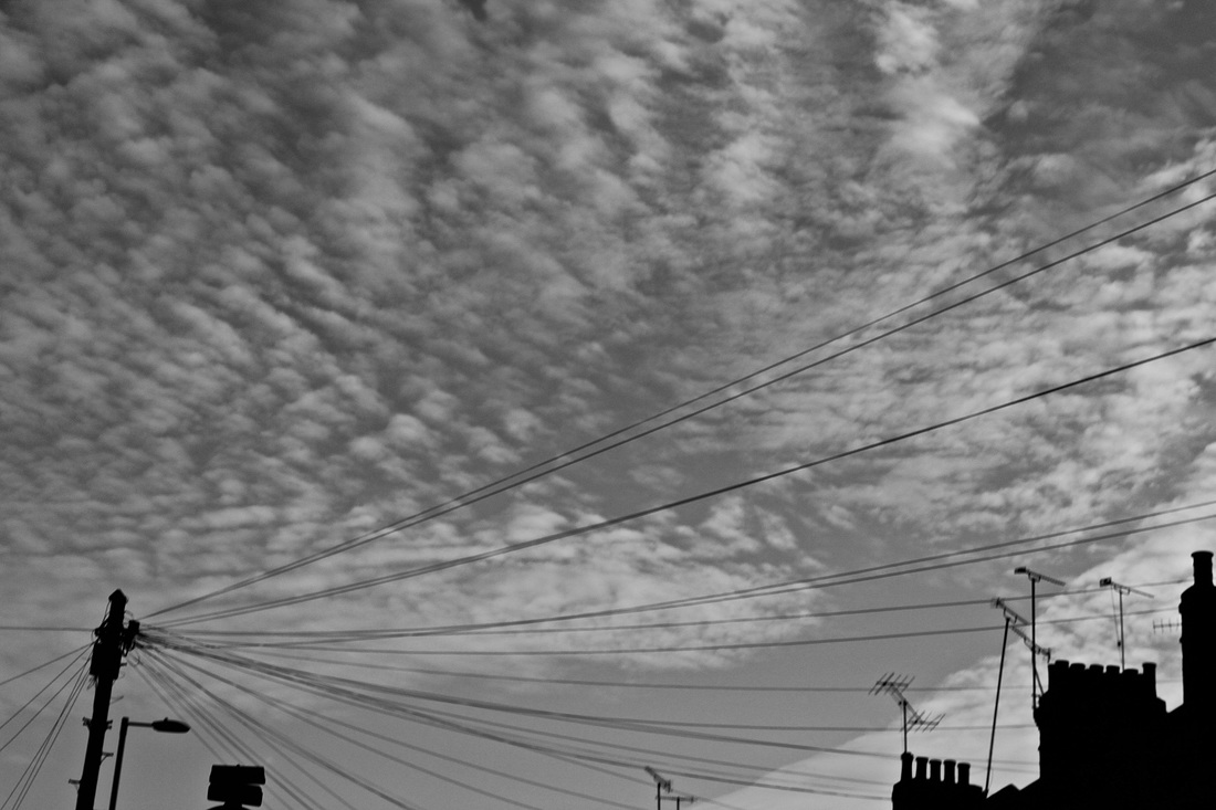
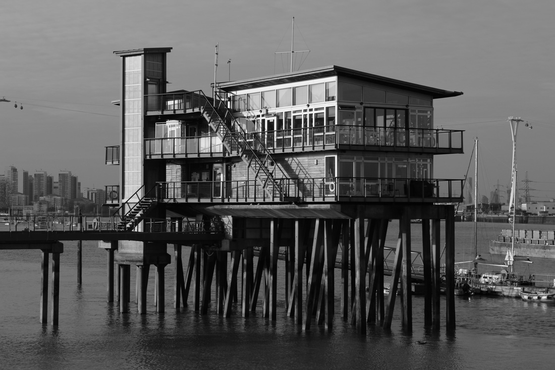
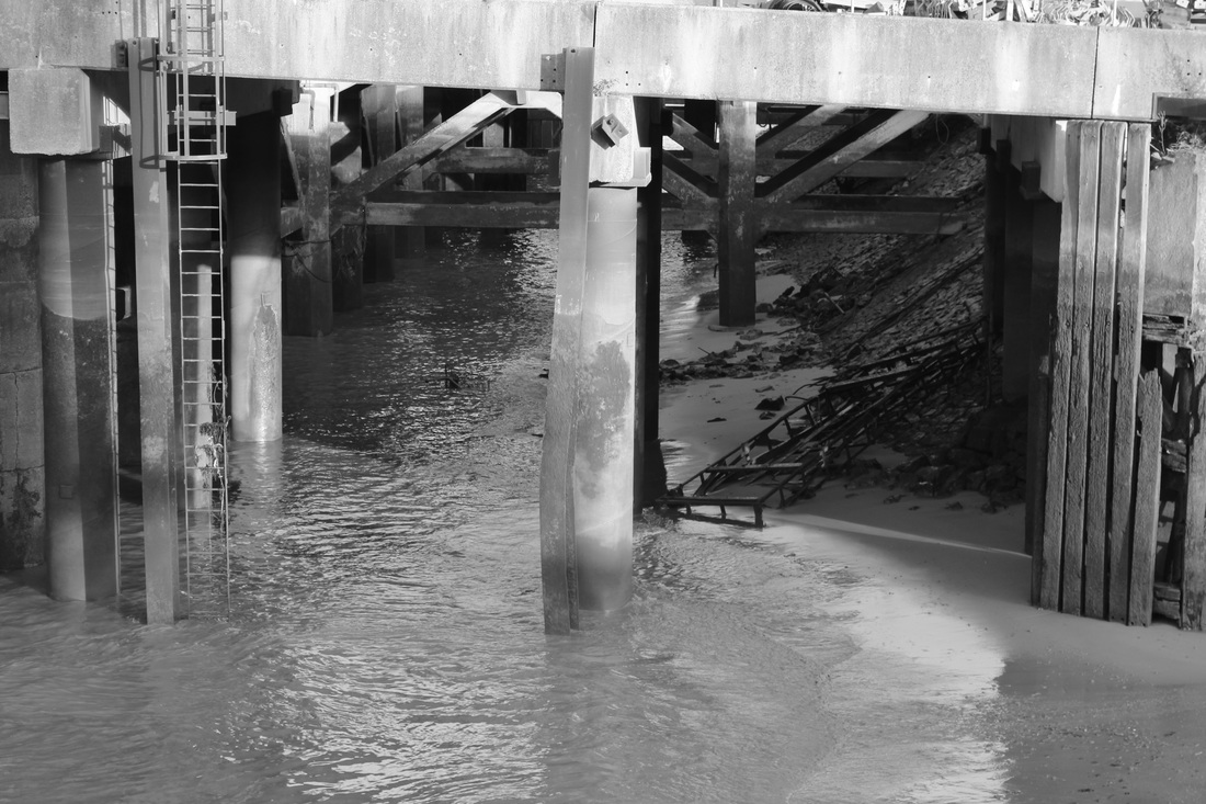
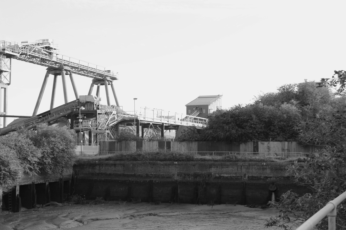
100 Photo challenge
Evaluation
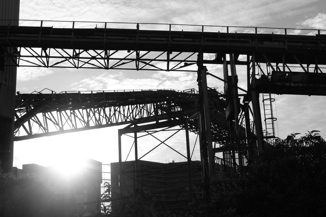
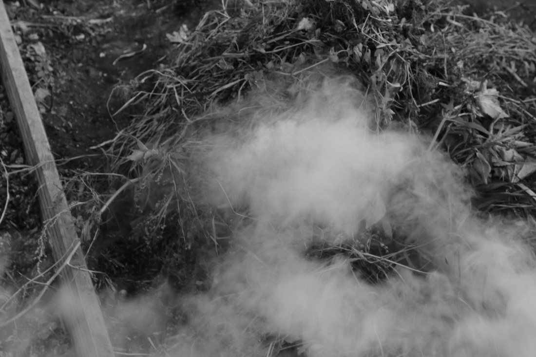
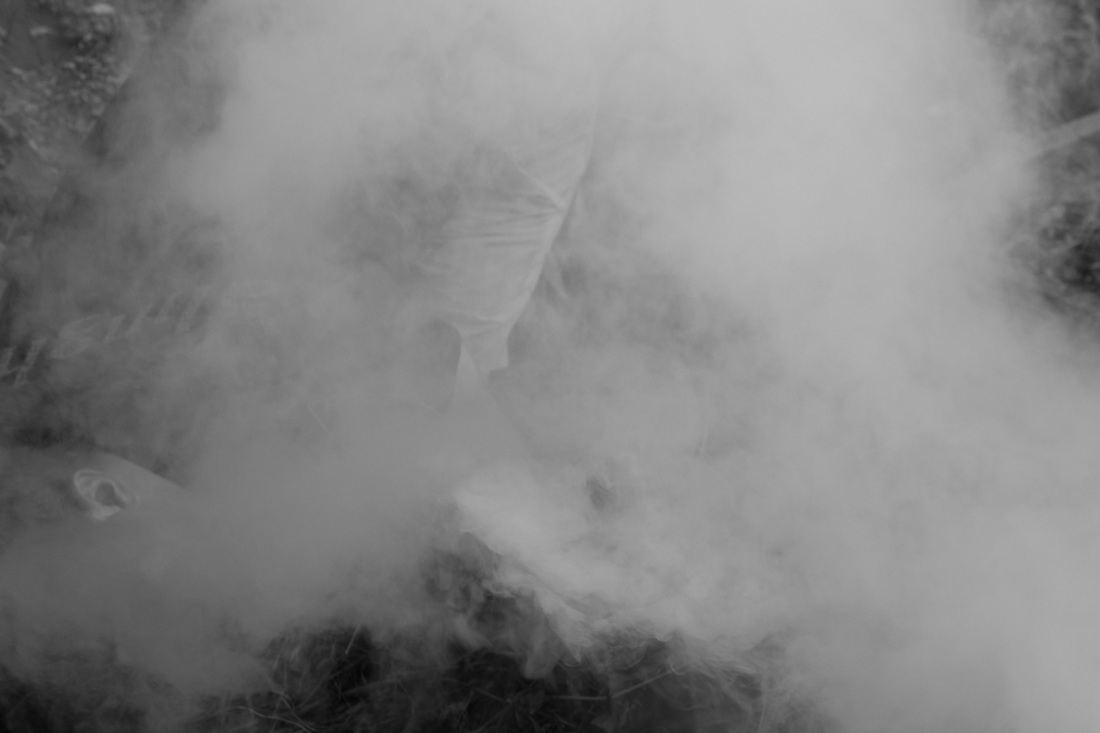
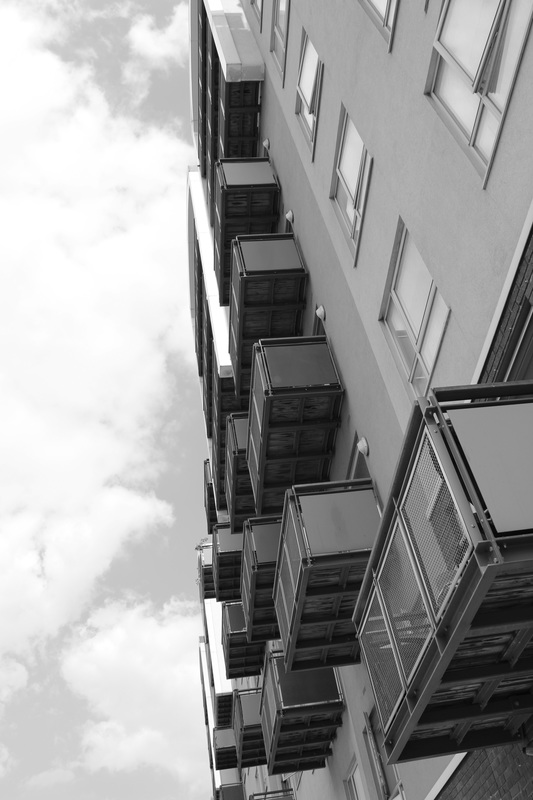
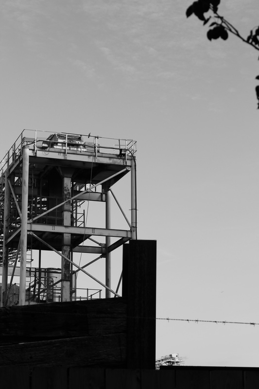
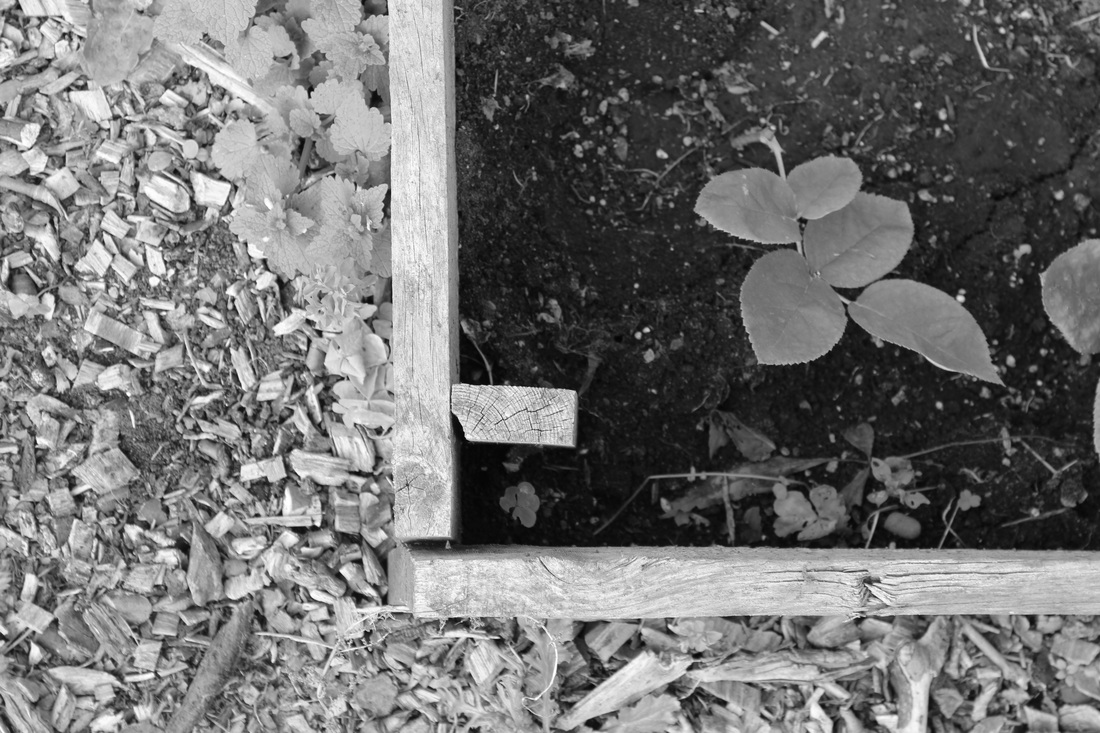
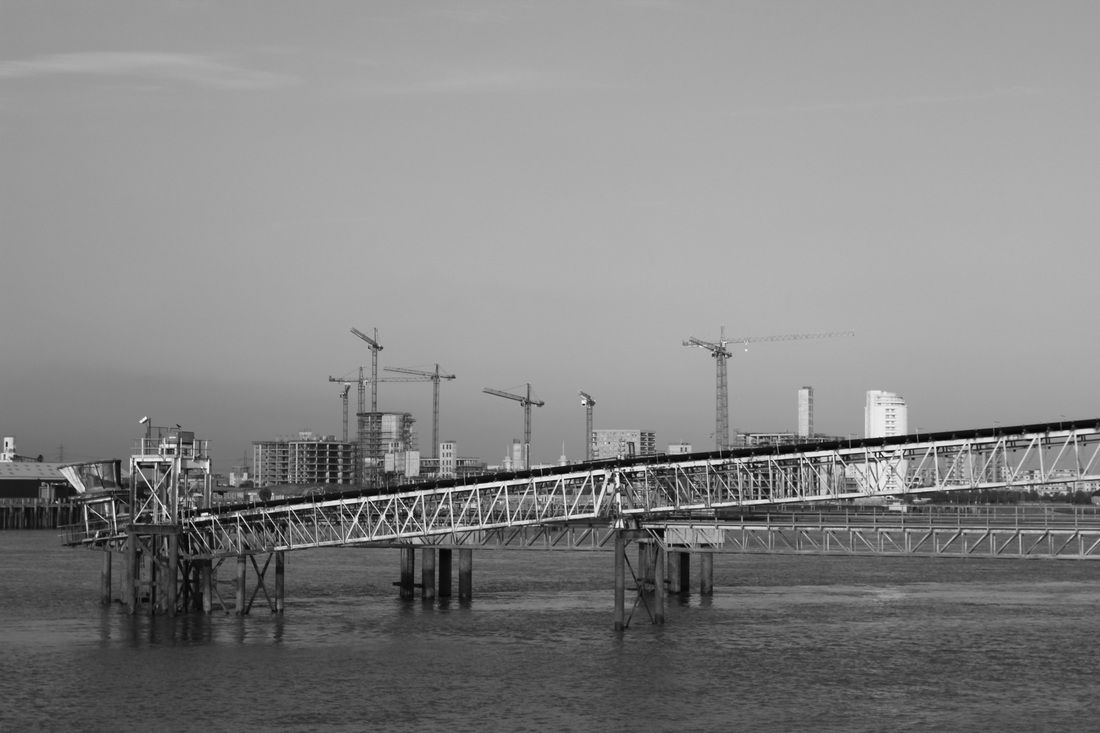
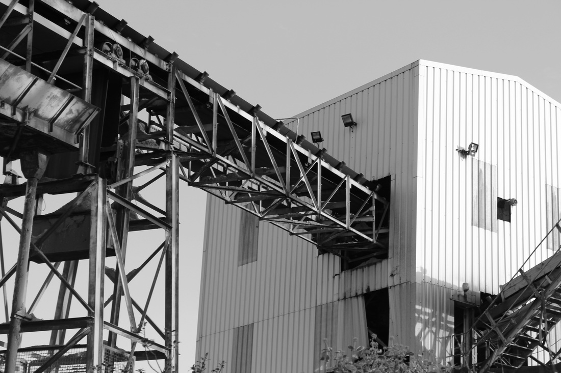
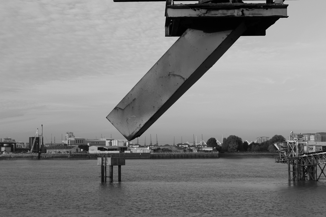
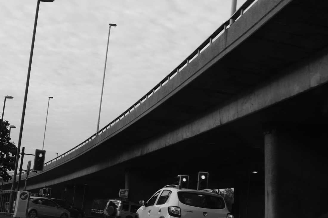
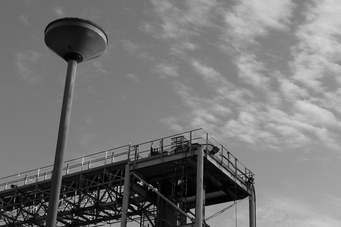
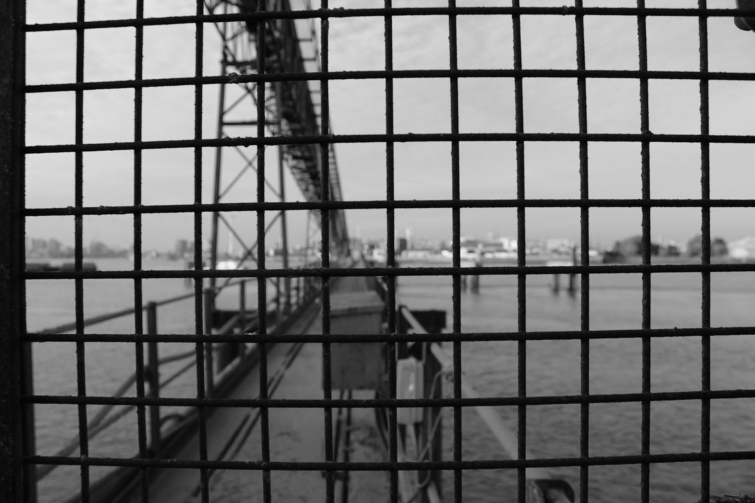
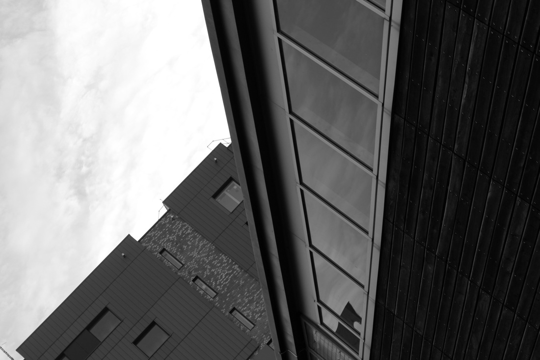
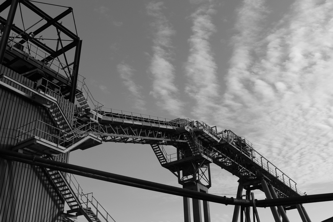
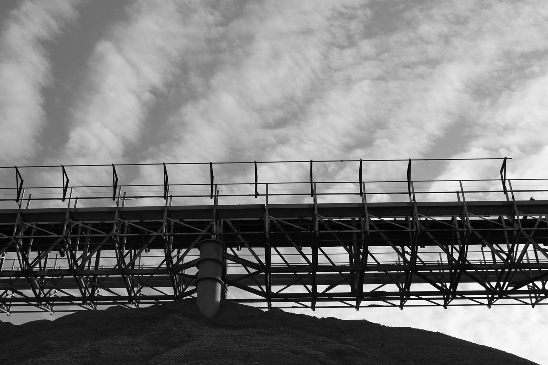
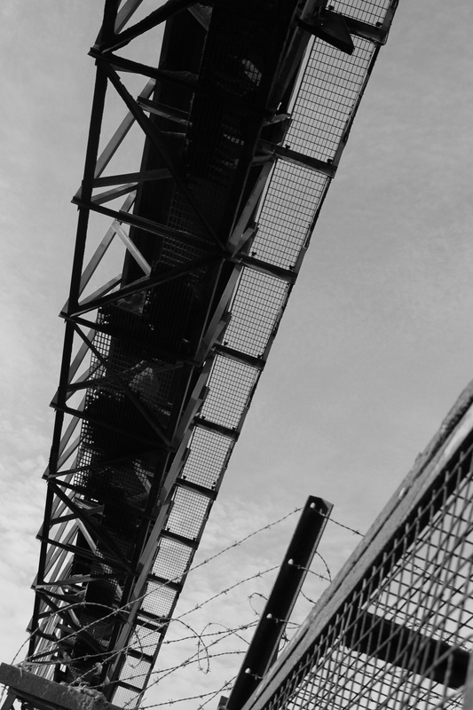
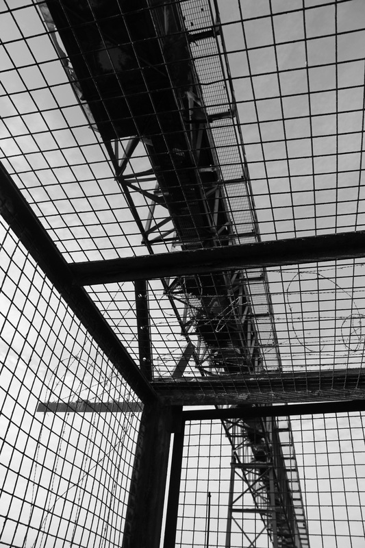
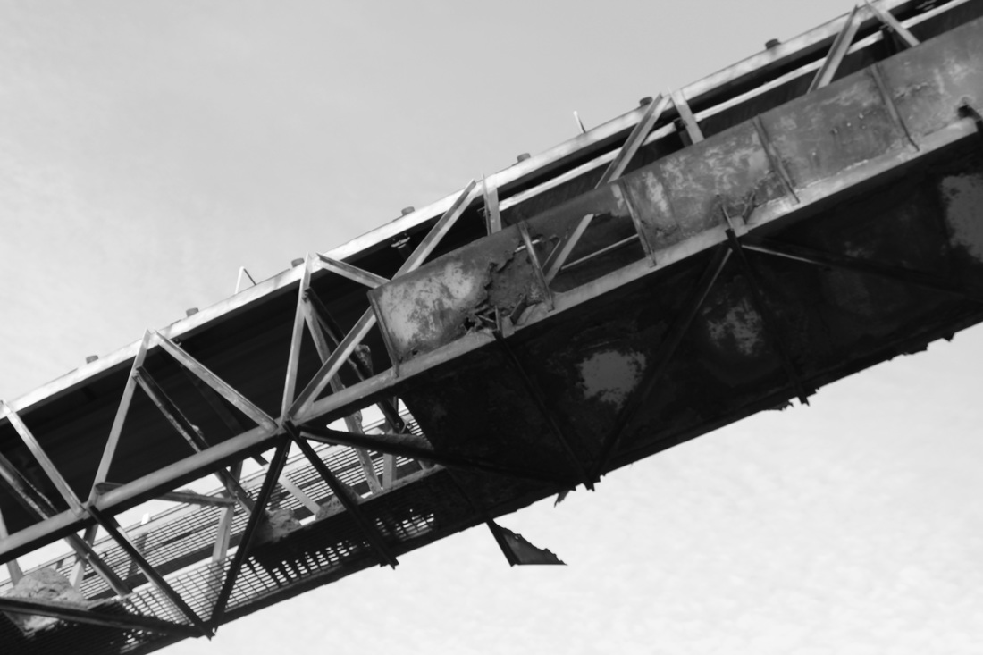
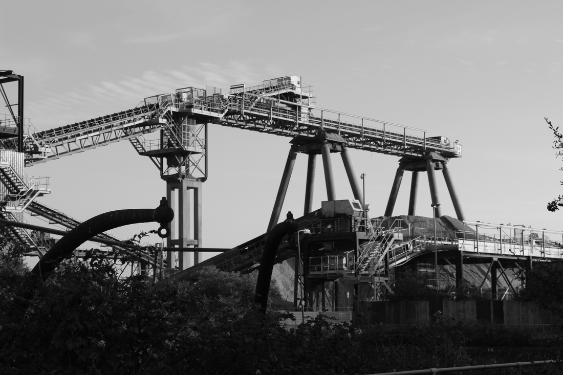
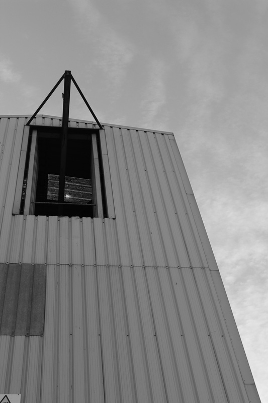
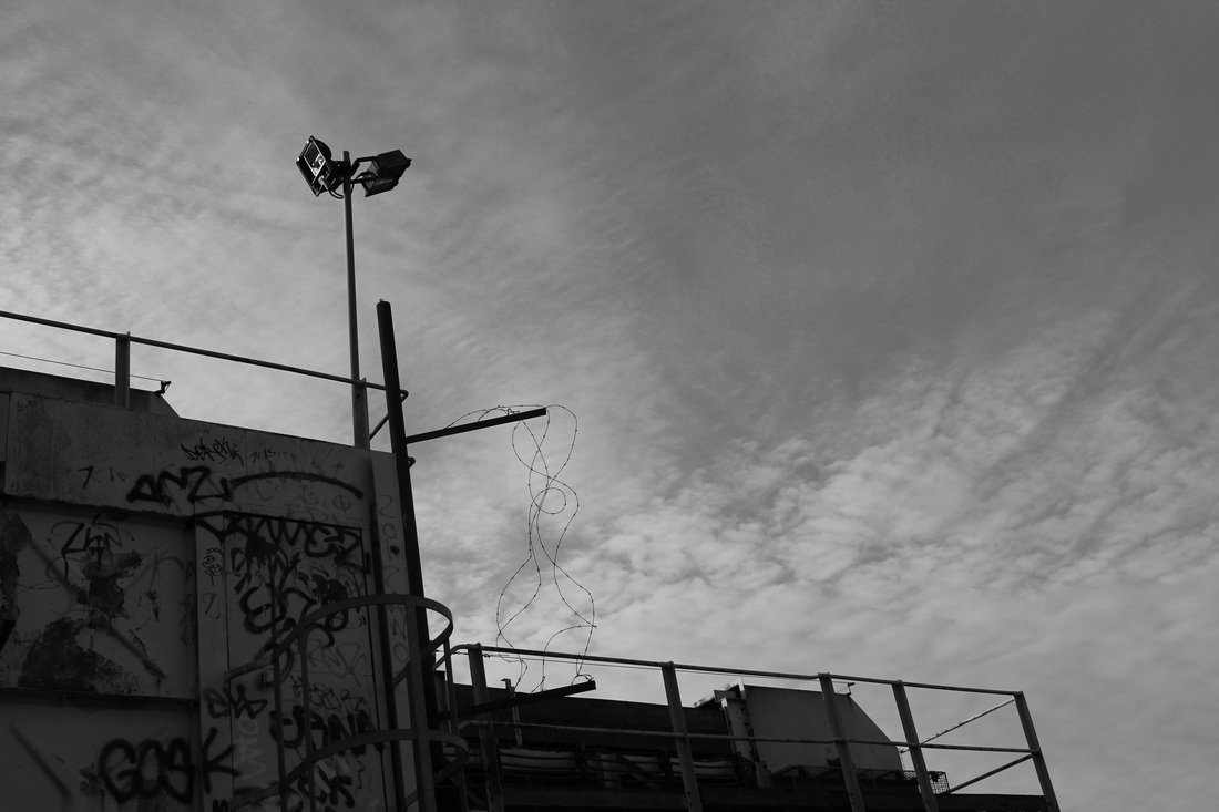
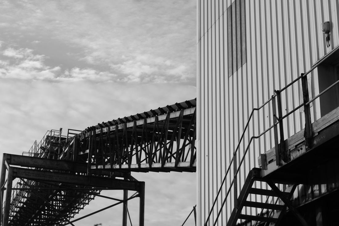
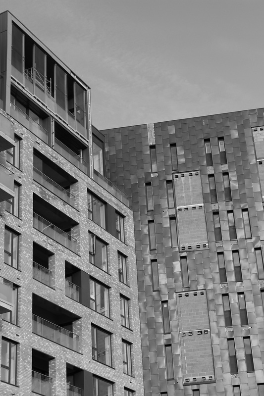
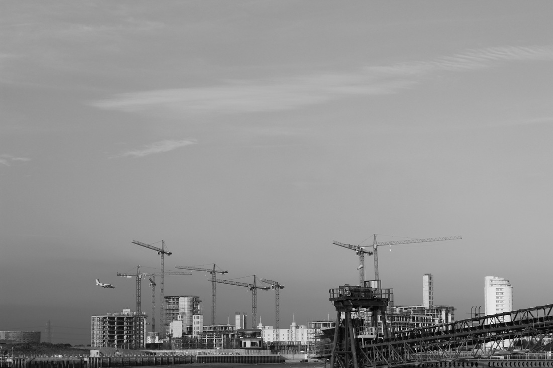
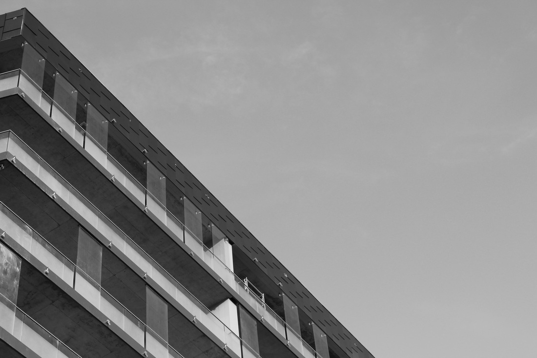
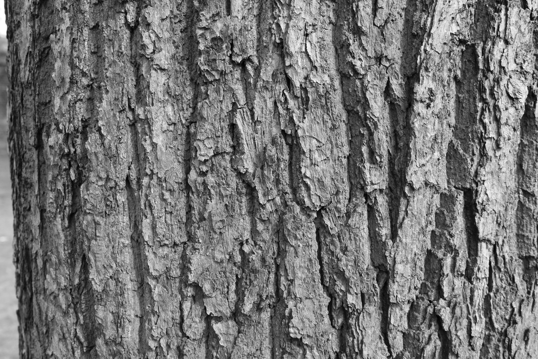
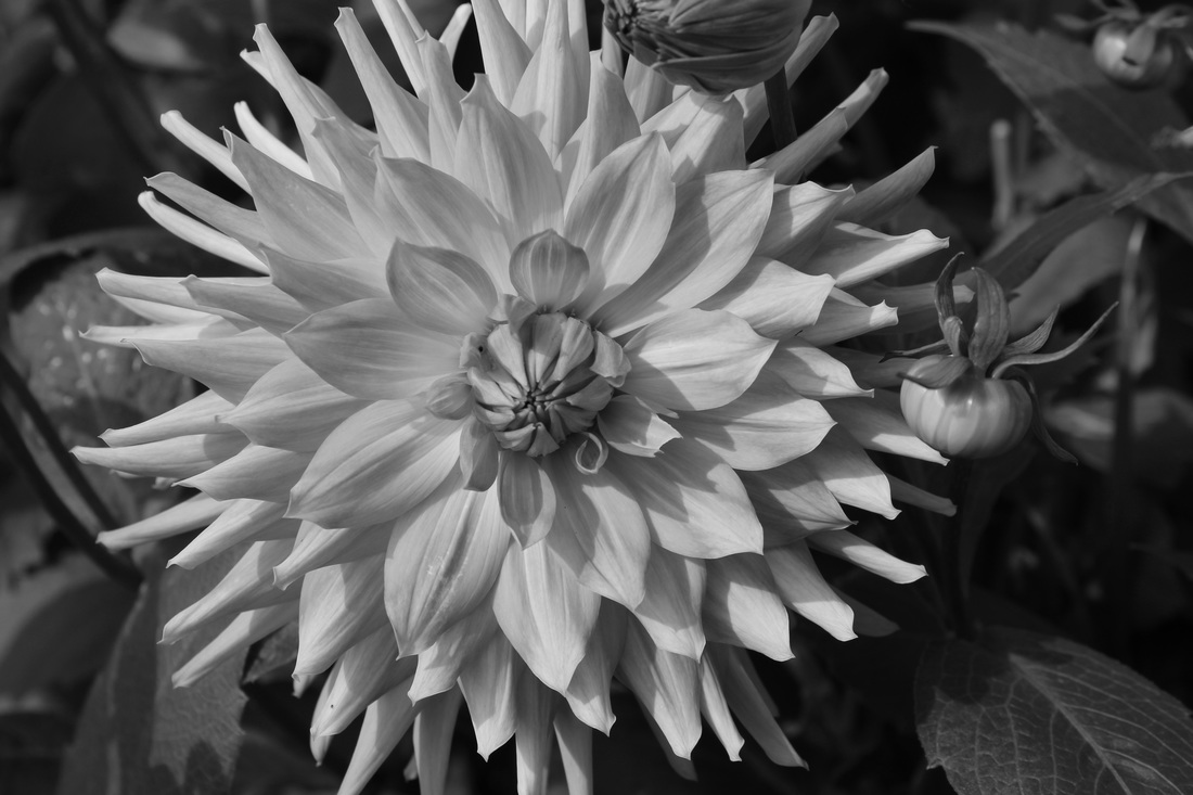
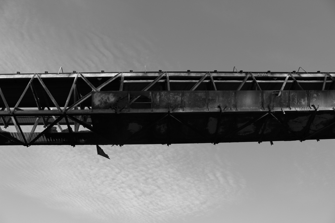
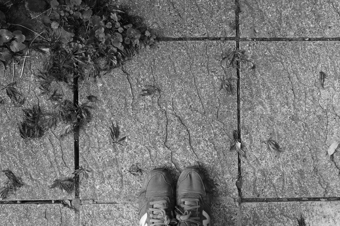
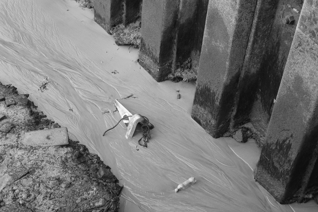
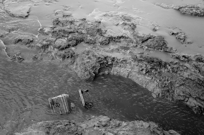
All of the images above, were based around the book 'The World is Beautiful' by the photographer Albert Renger-Patzsch. These photographs I took are focused around industrial and natural things that surround me, as are the photographs included in his book. All of the images above were taken with a DSLR in colour, then edited into black and white, using iPhoto. I did this because, I think it completely strips down the image, to just really focus on the different parts to of it, instead of being immediately drawn to a specific part of it, based on the colour. As well as this if my images were in colour I don't think anyone would really read into them , but merely enjoy the sight of it. I prefer most of my images in B/W because it would make people question more, why I photographed it.
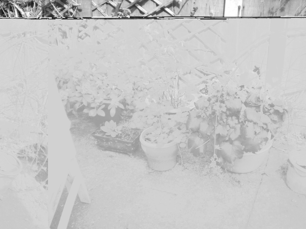
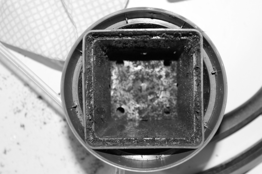
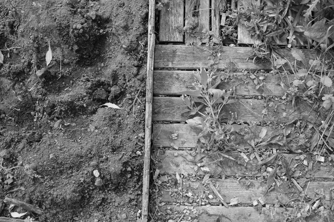
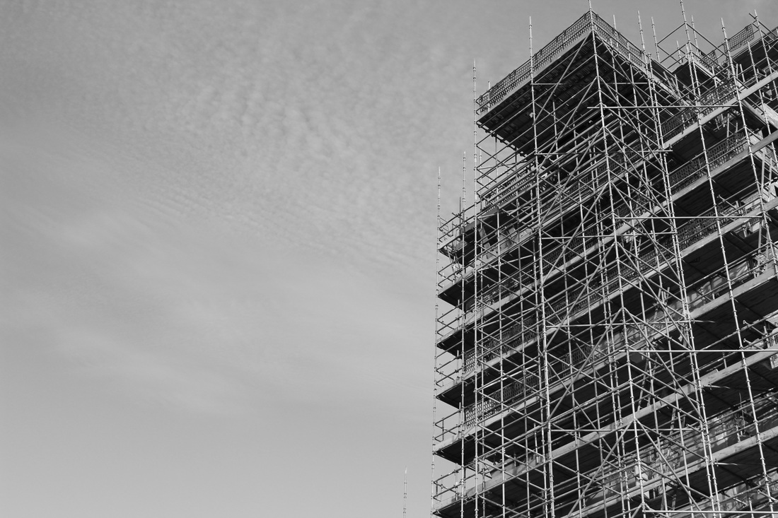
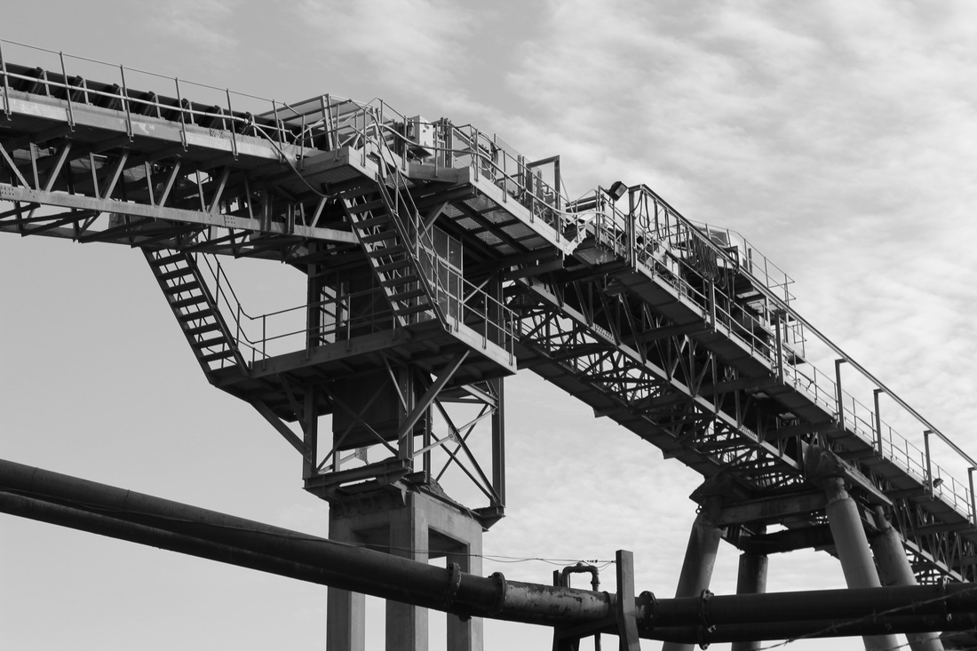
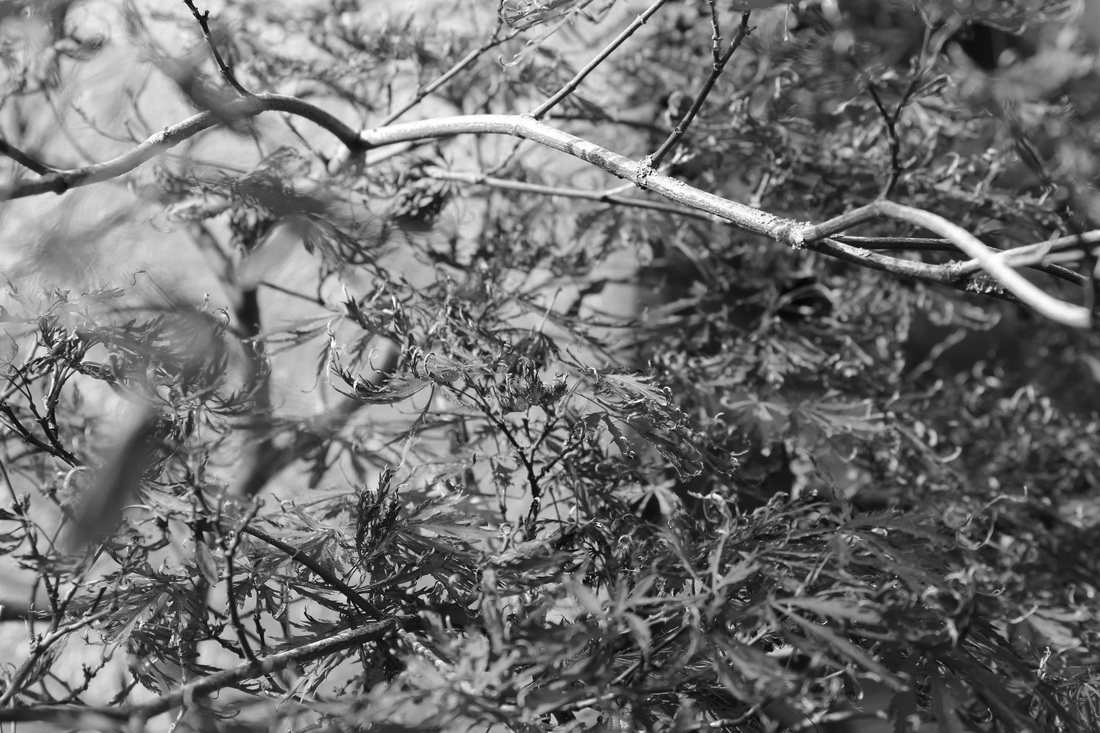
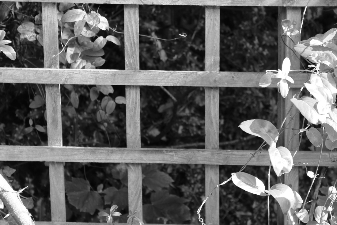
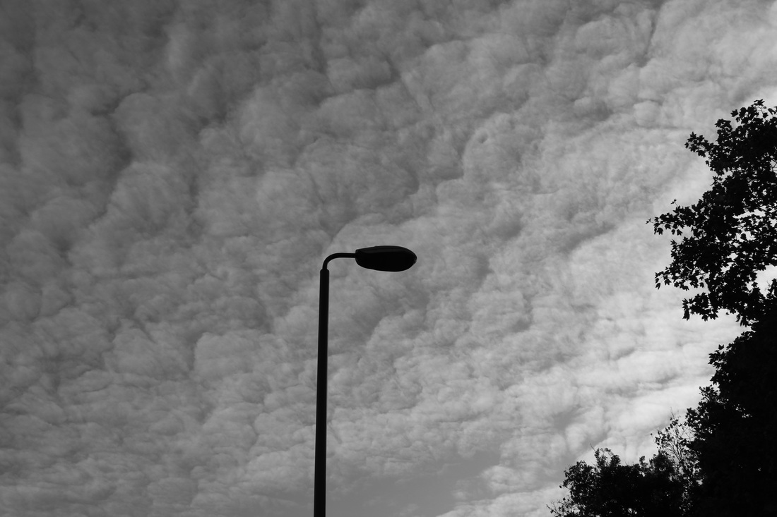
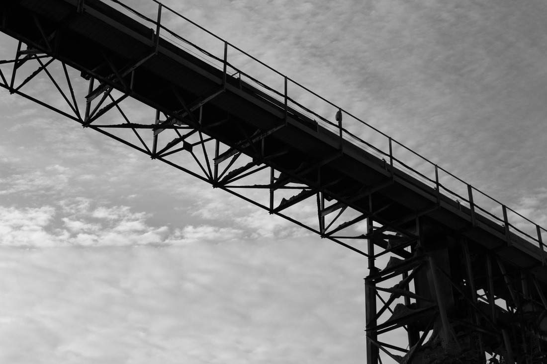
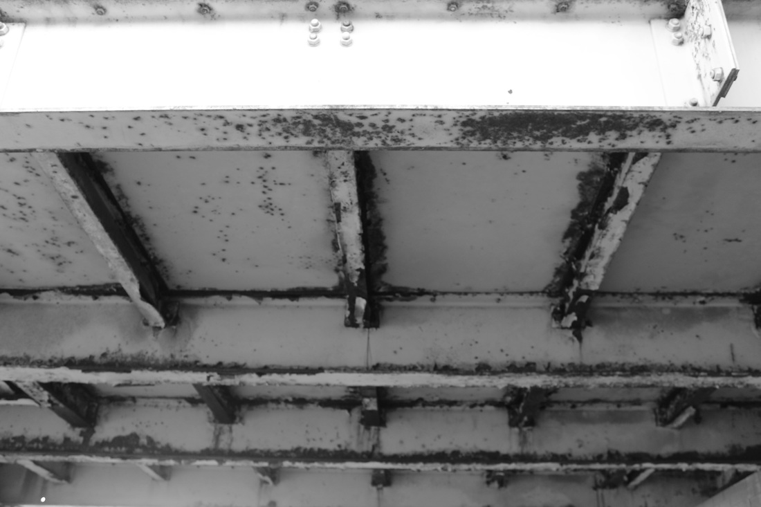
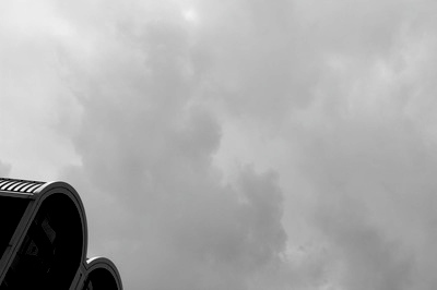
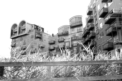
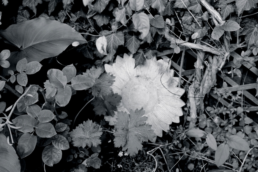
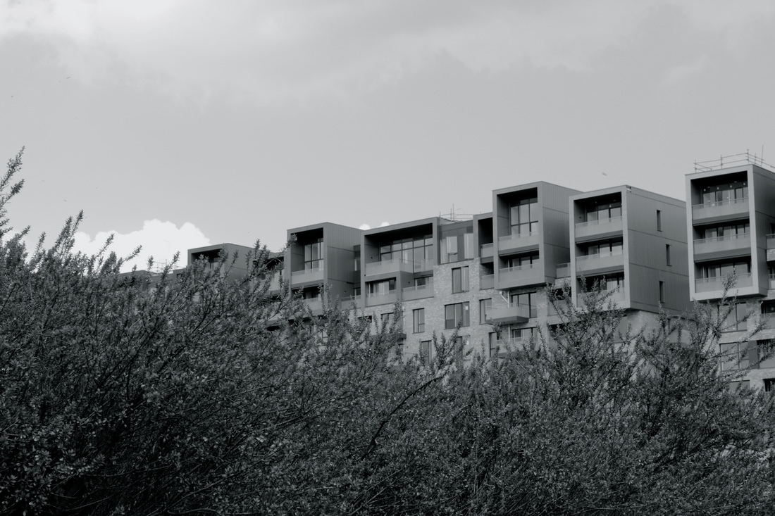
Strangely one of my images, when I uploaded it to iPhoto, became distorted, the original photograph was of some plant pots in my garden. It duplicated the image two or three more times, but into different colours all within one picture. Even though it wasn't what I was expecting, I really liked the outcome of it, as it looked as though I did it purposefully and made the picture look more geometric than it originally was, which overall made the picture more unique. I really liked the images of the mini bonfire creating the cloud of smoke, this is because for some reason it reminds me of an old B/W movie when they had the smoke machines. As well as this the smoke partially shields the things in the background, or just slightly blurs out something. I think this adds the mystery to the photograph being in B/W, as it makes it harder to tell what the smoke it covering. I would classify these images as organic, even though the bonfire was man made, because all of the elements in there are natural. Where as I would class all of the buildings as geometric. One photograph I like in particular, it the one of the large old walkway bit from a factory, that splits the image from side to side. By using B/W its easy to define the parts to where the metal has warn out, and started peeling, compared to other parts of it. I love the rough texture from it, compared to the smooth looking sky. One way I would improve on these images, would be by getting more of a variety of Geometric photographs. As well as this I would definitely use colour on the majority of the natural images, so I could get a wider variation of images.
Strangely one of my images, when I uploaded it to iPhoto, became distorted, the original photograph was of some plant pots in my garden. It duplicated the image two or three more times, but into different colours all within one picture. Even though it wasn't what I was expecting, I really liked the outcome of it, as it looked as though I did it purposefully and made the picture look more geometric than it originally was, which overall made the picture more unique. I really liked the images of the mini bonfire creating the cloud of smoke, this is because for some reason it reminds me of an old B/W movie when they had the smoke machines. As well as this the smoke partially shields the things in the background, or just slightly blurs out something. I think this adds the mystery to the photograph being in B/W, as it makes it harder to tell what the smoke it covering. I would classify these images as organic, even though the bonfire was man made, because all of the elements in there are natural. Where as I would class all of the buildings as geometric. One photograph I like in particular, it the one of the large old walkway bit from a factory, that splits the image from side to side. By using B/W its easy to define the parts to where the metal has warn out, and started peeling, compared to other parts of it. I love the rough texture from it, compared to the smooth looking sky. One way I would improve on these images, would be by getting more of a variety of Geometric photographs. As well as this I would definitely use colour on the majority of the natural images, so I could get a wider variation of images.
