Photo book - is a book in which photographs make a significant contribution to the overall content.
History of the Photobook
The Photobook is used as a way for a photographer to display a variety of their work, in a mini portfolio styled layout, which can be spread across a wide audience. They are usually self-published. No one knows exactly when the first official photo book was created, but it is to believed that
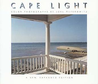
Joel Meyerowitz: 'Cape Light'
|
|
Joel Meyerowitz is best known for his coloured work, published in 'Cape Light'. These contemplative coloured photographs, were taken in Cape Cod and Massachusetts, which quickly became one of the most influential and popular photography books, within the 20th century. This book has been re-furbished in 2002, in it's original form, to include all of the now-iconic images of the original edition which was published in 1979. All of the photographs Meyerowitz captured, are in everyday settings, such as on the beach or balcony. I chose this book as my photo book study as I really like the way all the colours in his photographs are slightly washed out, which makes them look more retro.
|
|
I think Meyerowitz thought about the images he was taking to link them all together. They all show the classic beach lifestyle, whilst sticking to the colour theme, shown throughout his images.
The front cover to this re-furbished book, is a picture taken of the view from a balcony in a beach house. This image easily sums up the style of photos captured in this book, and clearly demonstrates what is to be expected, such as the beach/summer setting. This is also shown in the font used for the title 'Cape Light', as it is 3D, but where the shadow would be, is replaced by an image of a summer's sky. All of Meyerowitz's photographs, are taken on a digital camera and are all placed equally in the book, with one image to every page, but without taking up all of the page, so they are all left with equal sized, white boarders. |
|


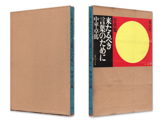
Takuma Nakahira - For a Language to Come
|
'A Language To Come', was Nakahira's first photo book which was published in 1970. All of these photographs are taken in Japan, representing a turning point in post-war Japanese photography. In this book there are 100 black and white images, including work from a photography magazine 'Provoke'. The majority of his images are spread across two pages, landscape, apart from some pages where two images are placed next to each other, but go well together. It looks like he captures these pictures using a film camera, because some are quite blurry. I think the images were printed onto the pages in the book, which makes the look more grainy and patchy and therefore suggests the pictures are quite dated from the picture quality. However before this it looks like the picture was edited to create a higher contrast.
|
|
|
I don't like the cover of this book, because I don't like the colours used, such as the red, blue and pale yellow. I don't think these reflect the actual content of the book and whats its about. I would have preferred the front cover to be filled up by one of Nakahira's images, as I think it would attract more people towards it. However these images stand out, because they all follow the same editing style, which makes them look more like a group of typologies.
"The artist explores the power of photography to express that which remains unspoken. Remnants of language are still apparent in his work. This publication had a print run of only 1,000 copies." (Titus Boeder). |


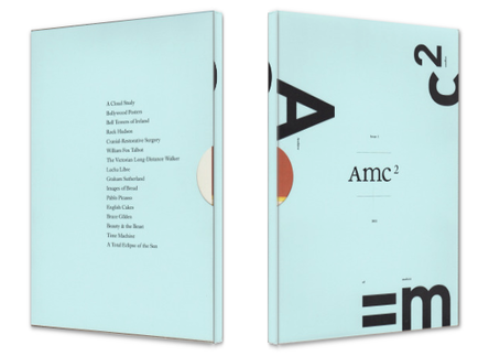
Amc2 journal Issue 1
'The Archive of Modern Conflict collects material dating from prehistory to the present day. As the subject areas expand, they intertwine to reveal unexpected stories about the nature of our world. The inaugural issue of Amc2 journal brings together different groups of work that illuminate lost corners of our cultural life. Photography is, as ever, the keystone of the collection.'
'What's so great about the people behind this ever-growing eclectic collection, is that they allow the reader to discover threads of connections between, say, hand-tinted Indian portraits from the early 1900s and the garish colors of Bollywood movie posters and something as esoteric as a Rock Hudson paper doll kit with a variety of kitschy hand-colored outfits for that movie star from the 1950s and 1960s.'
'What's so great about the people behind this ever-growing eclectic collection, is that they allow the reader to discover threads of connections between, say, hand-tinted Indian portraits from the early 1900s and the garish colors of Bollywood movie posters and something as esoteric as a Rock Hudson paper doll kit with a variety of kitschy hand-colored outfits for that movie star from the 1950s and 1960s.'
|
I quite like the cover of this book, from the pale blue colour, and the repetition of the name, in bold letters and being separated. I like it how an image from the book was on the cover, as there is such a wide variety of content in their, which is listed on the back cover. As well as this on each page there is a section at the bottom, which gives a small description of the image/images. You can easily tell the images weren't all taken in the same time period, from the style and quality of the pictures. For example
On each page of the book the two pages next to each other are usually the same colour, as the content of the pictures, or time periods, are linked together. However the actual image layout is in an irregular pattern, as on some pages there are three different sized images, and only one image on another page. |
|


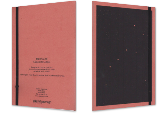
Cristina de Middel-The Afronauts
|
'In 1964 a Zambian science teacher named Edwuard Makuka decided to train the first African crew to travel to the moon. His plan was to use an alluminium rocket to put a woman, two cats and a missionary into Space. First the moon, then Mars, using a catapult system. He founded the Zambia National Academy of Science, Space Research and Astronomical Research to start training his Afronauts in his headquarters located only 20 miles from Lusaka.' The photo book Afronauts published in 2011, tells this story and became extremely popular. |
|
|
From the front cover, it tells us that the images in the book are going to be linked to space somehow, as well as this the style of the book cover looks like a journal, which suggests that the photo book will take people on a journey through something.
This book stands out, as all the images follow on from one another, and some are drawings, used as diagrams, which suits the subject matter, as it show the story of the African astronaut. 'De Middel overlaps colour photographs with the other written and drawn material in a playful combination of storytelling and documentation.' The images are layer out in different ways, such as one image taking up two pages, or a blank page, with a small image on the next page. As the page layout is quite varied it makes the book feel more recent than dated. |


First set of images


For this set of images I was trying to focus on taking photographs of unnoticed things around my school. I realised after I took the first few pictures, that I found this theme quite boring as well as the pictures being dull. This is because I don't really like photographing around my school as, I have done it too much, that I found it hard to find new things to capture, that also fit the theme, which is why I didn't take that many images. However I do like the last three images from the way I edited them, especially the third to last one, of the corner of a wall.
Editing


To edit these images I selected my favourite images to edit into black and white using iPhoto. I wanted to edit these images into black and white, because I didn't like the colours in any of the images, as none of them stood out to me. I also tampered around with the exposure and contrast levels, which let me create more interesting photographs overall for my photo book.


I edited these images with extreme contrasts to experiment with ways to make the images abstract. I don't like the images with the high brightness, as I don't like the grey mid tones that come through, as I think it makes the images seem unfinished. I quite like the dark images, as it's a lot harder to tell what the objects in the images are. My favourite image was the top middle image. I like this image as the overall image is quite dark, but there a variety of tones still come through clearly. It was interesting experimenting with editing images with an extreme different in brightnesses. From this experiment I learnt that I quite like black and white images, as I think it's easier to edit the images, to make one specific part stand out, for example the face in the flower image.
Second set of images


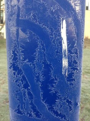
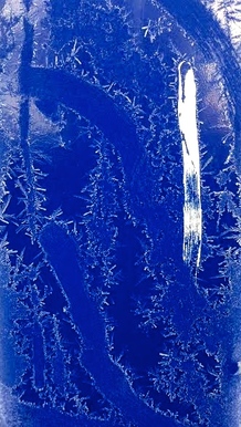
I took these photographs around school, all in the same time of day. Before I took these images I didn't think about a theme to have in mind, to base the images on, but once I started taking my pictures, I realised I was mainly focusing on the weather, and the effects it has, such as frost on objects. Overall when I look at these images, they all feel quite cold.I then cut the images down, and picked my favourite ones to put into my first photo book. However I didn't edit the images in any way, because I wanted to try and take images the way I would want them to look originally without any effects, which worked with most of them.
|
My favourite imageOut of all the images, this is the one that I think most stands out and is my favourite. This is because I like it because its quite hard to tell that the blue object is the pole, for the basket ball hoop. I like the white stroke of paint running dow it, as I think it makes the frost on the pole and the electric blue colour, stand out more. However one thing i don't like about this picture, is the background of the grass and building, as I think it dulls the colours of the blue. So I then decided to edit this image to show how I would have liked the image to have come out overall.
|
|
First test Photobook


I cut the images down to 5 as I wanted to start off with quite a small photo book. I don't really like these images that much, mainly because they all follow a theme that ends up with the same kind of pictures, which was the frosty weather. Overall I don't really like the way this photo book tester came out, as I don't like the images that much, as the majority of them all look the same, with one main focus in each photograph, which I find quite boring. I don't think I want to use any of these images in my final photobook, as I want the images to be different, whilst still fitting into the same theme. I made the photo book out of black card, which I used as the pages and stuck the images onto. To join the pages together I made a hole in the top left corner of each page and tied a piece of string through them, linking them together.
Final photobook plan
Format
For the format of my photo book, I don't want the images to be in a regular order, like one image per page. I would quite like to have a random order like Cristina De Middel, this is because my photos would seem quite random to the audience, as they are personal to me and some might not make as much sense as others. Therefore I think a random worded would work well, especially putting two images next to each other, to contrast the differences, but also show some similarities, like a diptych. As well as this I would like having on a couple of pages, one image spread across the two.
I'm not sure how many images I want in my photo book. I think I will use around 30-50 images maybe, as I don't a really big photo book. I think when someone sees a large photo book, they end up quickly flicking through the images without really looking at them, and I don't want lots of images anyway.
On the front of my book, I want to use one of my images featured in the book, to show an example of what the book is about, and what the content will be like.
Materials for the Photobook
For the actual photobook, I think I would prefer it to be handmade. I would do this because I wanted to use a disposable camera to show that expensive cameras aren't needed to create great photographs. So I think that sending my images of to be put into a professional photo book won't go well with the theme I was going for. I'm not sure what materials I will use yet, to create the photobook. I want to print my images out instead of using the images on the glossy paper, as I don't want to stick those images into the book. I know I want something to create a hard back cover, so the person looking through it, can't quickly flick through the pages as easily. For the pages, I will probably just use a type of card, instead of paper, so the pages don't rip easily.
For my photo book, I didn't want to use a DSLR, as I didn't want all my photos to come out in clear focus. I really wanted to try using a disposable camera. This is because I really liked the way the photographs turn out from them, with a quite grainy effect with a natural filter on it, that makes the images look more dated. In terms of the context of the images, I want to try taking pictures of a few days, where it shows what I do, like going out places with friends. Although I think I would like to use black and white film to contrast with the coloured film and make the colours stand out more. I thought of the idea when I was looking at the photobook 'The kids are alright', by Ryan McGinley. He takes his images to portray the life of teenagers and their crazy lives which were taken from 1998-2003. I want my photo book to be quite personal, as I haven't taken any photographs like that much. Here are a few examples of Ryan McGinley's work, with each of the images, he found out a personal story from each person he photographed.


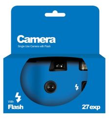
So far I have only been taking images on a disposable camera would also like to experiment with different types of film cameras, that have different effects and layouts. I decided to use this camera as many of my friends have used it, to take pictures at festivals they have been to or parties, as it is cheap to buy and easy to use, as it doesn't have any settings, just a flash. As well as this because of the retro filter it coms out in, especially when the flash isn't on, I want to edit the images by editing the colours, so make them stand out more. However using the disposable camera has been harder than I thought, because you have to wind the film to take a new picture, I don't know if the film had winded too much, so I will have to see how the Images come out, once they are developed. The pictures I have been taking are mainly of my friends, places that caught my eye and other things that show my life through photographs. I've tried to make all the pictures different and in different lightings to really get the effects from the disposable camera.
First set of images
As you can see from my first set of images, the majority of the photographs didn't come out. A few of the images came out really dark when they weren't taken outside in daylight. However I only really liked 5 of the pictures that came out. Here are my favourite pictures from my first set.


I then edited these images mainly by, brightening the images and increasing the saturation, cropping them and changing the tint. I only edited them slightly, because I didn't want to lose the effect from the disposable camera.


To improve from this first set, when I use my next disposable camera, I will take more during the daylight, or if I am taking them inside, I will use the flash to brighten the images. I want to take more images around London, for the buildings and architecture. I also want to photograph places that are corded with people, because I want my theme to capture the life of the city.
Martin Parr
Martin Parr is a British documentary photographer, photojournalist and photobook collector. He is part of a group called Magnum Photos, which is an international photographic co-operative owned by its photographer-members, with offices in New York, Paris, London and Tokyo. By being in this group he has published around 40 solo photo books.
I really like his images, by the way he edits them to make specific colours in the images stand out, which is what I would like to experiment with, with my own images. As well was this, all of his images have messages, which are disguised behind the bold colours used to draw in the audience. I like that he doesn't push the messages right to the surface of the photographs, instead he gives people the option to read into it or not. Parr was accused of exploiting the working class with his portray; of 'New Brighton' in 1986, however he said he was just picturing what he saw.
"The fundamental thing I'm exploring constantly is the difference between the mythology of the place and the reality of it. Remember I make serious photographs disguised as entertainment. That's part of my mantra. I make the pictures acceptable in order to find the audience but deep down there is actually a lot going on that's not sharply written in your face. If you want to read it you can read it."
One thing I like about the format go Martin Parr's book Home and Abroad, is that under all of his pictures he quotes the location of the pictures. I quite like this because it lets the audience picture whats going on outside the picture, in the same setting it was taken. As well as this on the majority of all of his photo books, he has one of his images from the book on the front cover. I like this, as apart from the name, the front cover tells us what the content of the photo book will be like.


Response
Here I edited a few images to try and make specific colours stand out. However unlike Parr, I tried to make the colour change quite subtle to start with, so it is less noticeable that the photographs were edited, but on further experiments, I wanted the edits to be more obvious.
The first image I edited the most this is because it was harder to just focus on one section of the photograph or colour that I wanted to stand out more. Instead I had to make the colours stand out more, as the image is filled with bright colours already. So I increased the brightness, contrast, tone and the definition. The main colours I was making to stand out, were the flowers, greenery and the buckets.
On the second image, I didn't need to edit it that much, the main thing I did was lower the temperature of the picture, to make it more blue, which brought out her jeans and jumper. This also darkened the red from her coat and the bus stop, but I think that it made it stand out more on the grey bricks. I then increased the brightness, but left the contrast, as I didn't want the brown bricks to stand out more.
For my third image, the exposure was too bright, so the first thing I did was lower the brightness, I then increased the saturation to the highest, as well as increasing the contrast a little bit, to make the black stand out more.
I followed the same process with my fourth, fifth and sixth images.


Previous Images
All of these images had been taken previously to this project, but I wanted to experiment with the colour in the images. I picked these specific ones of the ocean, because originally they reminded me of Joel Meyerowitz's 'Cape Light' photographs. They looked similar due to the setting of the pictures, and some of the light faded colours in some.


I then edited the colours in all of them (like Martin Parr), to try and only make one main colour stand out, such as the colour of the sea. I edited these specific images, because if they were all landscape, they reminded me of diptychs, as there is a line that cuts them down the middle. I really like the final outcome of these images, once edited as I think it being them to life a more, and are more interesting to look at, as there is a wider variety of colour.


When I was looking at a couple of these images I realised on their side, some looked like Diptychs. I quite like them turned on their sides, especially the first one, as it looks more like two different images, have been pushed together. I also like the contrast between the two halves to the image, such as the rough textures from the rocks and bumpy sea, compared to the smooth clear sky. However I think the second image looks less like a diptych as the sun links the two halves of the photograph together, from the reflection onto the ocean. So I then cropped the second image, to make the line down the middle clearer. I don't like the way the cropped pictures came out, because they were really pixelated, and the sunset colours faded more into each other.
Martin Parr Response #2
For my second response to Parr, I decided to use another disposable camera and take images of everyday things, that people would usually overlook. This camera was very easy to use and was very convenient as I could keep it in my pocket and have Whilst taking the pictures I had to think about what I was photographing, and if it was different to others. I took my images around my local area and tried to stay in one place as long as I could photographing, before I got bored and wanted to try a new location. Once I was in an area, I would walk around and take a picture of an everyday things, as they would also be my everyday surroundings. I really liked the final outcomes of these images, as lots of them were taken by chance and focusing on threshold concept #6 'photos rely on chance, more or less'. But from the framing of the images, some of the photographs looked staged in some areas, such as the one of a boy standing under a tree. However there were a couple of images including my friends, who I told beforehand I was taking the image, so their body posture and facial expression had changed.
The next thing I want to do is go up to London and capture the weirdness of everyday things, as there is always something going on in London. However instead of using a film camera I want to use a DSLR this is because I wan a variation in style of images, like the camera quality.
The next thing I want to do is go up to London and capture the weirdness of everyday things, as there is always something going on in London. However instead of using a film camera I want to use a DSLR this is because I wan a variation in style of images, like the camera quality.
Here is my set of images using the second Disposable camera.
Final Photobook


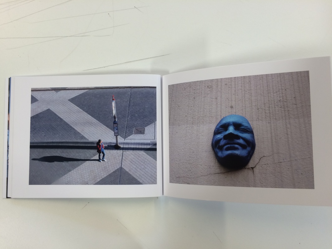

I am really pleased with the way my photo book has turned out. I am really pleased that all my images follow my theme of my surroundings, such as places I always go to and the people to surround me in my life. Although my photo book is short, I think that from someone looking at it, they will be able to realise the theme I was following. I didn't want the page layouts to be the same throughout the book, as I wanted some variation. I decided for majority of the pages to have two images across a double page. To decide what images to put next to each other, I mainly focused on looking at the colours in the pictures. The images with similar colours in them I placed next to each other. However with the pictures that I think didn't link with other images, I left a page blank so there was only one image on one side of a double page. I am glad I kept the images in colour, as I had been experimenting with black and white photography earlier in my photo book project. By leaving my images in colour without editing most of them, it captures my true surroundings and what things looked like at that moment in time.
I really enjoyed the process of creating my photo book using photobox. I would like to try creating another photo book in the future, as I think it's a really professional looking way to display my images.
I really enjoyed the process of creating my photo book using photobox. I would like to try creating another photo book in the future, as I think it's a really professional looking way to display my images.
Essay
I started off this project by investigating photographers who have created photo books themselves. I looked into 4 photo books that had caught my eye, these were; Cape Light, For a Language to Come, Amc2 journal Issue 1 and The Afronauts. As well as standing out to me, I specifically picked photo books that were published in different periods to see how taking images and editing them over time.
Cape Light (refurbished) is a photo book created by Joel Meyerowitz. I looked into further detail as the images looked quite retro and all the colours included were all soft tones. From looking at his images and the calm feelings I got from it, made me want to take my own images responding to the style of photo and colour tones Meyerowitz focuses on. When I thought about the retro outcome of his images I had the idea of using a disposable camera to take my images. This is because they have a natural outcome of retro faded tones. Furthermore from the start of this project I knew I didn't want to edit any images, but create the effect I wanted naturally by taking the images from specific angles and brightnesses.
For a Language to come is a photo book by Takuma Nakahira published in 1970. All of his images are in black and white. But what mainly stood out for me was that all the pictures were grainy, which gave them an amazing texture.
The final third book I investigated was Amc2 journal Issue 1, which is a collection of different images taken over different periods by time, from a variety of photographers. This was useful as it allowed me to see a wide range of techniques used to capture images, and ways they were edited.
After looking at these photo books in detail I then started to think about the theme for my phonebook. I decided I wanted the photo book to be quite personal, from there I started taking a couple sets of images, however I didn't particularly like the outcome of them, as I found the images were repetitive as I was mainly photographing family and friends. As this was very limited, I opened my theme up a bit to allow a wider variety of photographs. I then came up with the theme of surroundings, which I found was still personal to me as the surroundings are my experiences. I then just took my camera with me when I was going out. I used two cameras for my photo book, which was a DSLR and a disposable camera. I wanted to use two different types of cameras, so I could contrast the differences in the outcomes of images. What I likes about using my digital camera was that all the quality of the images were clear and I could straight away see the picture I just took, so if I wasn't happy with it, I could take the picture again. However with the disposable camera, there is only a certain amount of images I can take, so I just had to focus more on the image I was taking, as I didn't want to waste the film. However once I got the images printed, hardly any of the images came out on the first camera, as they were nearly all completely black, even though this set e back, I still wanted to experiment more with the camera, too get the first outcome I hoped for, so I got a new camera, which images came out clearer and brighter than the first bunch.
I edited most of my images using iPhoto or photoshop, to brighten the images and to enhance some particular colours in the mages to make them stand out more. Seeing the final outcomes of my images, I knew I wanted to make quite a small thin photo book, as lots of my images were quite random, I didn't want to create a larger photo book, as I think sometimes some of the images can be flicked through too quickly without properly looking at them.
To create my photo book, I used the website Photobox, here I picked the size of my book and could create the variety of layouts I wanted to experiment with. Beforehand I had planned which images I had wanted on each page and what style of layout they would be in. However once I actually saw all the images and layouts on the screen, I did change a few of my previous ideas, such as I realised some images didn't look good with certain images I had planned to put them next to before, as they weren't related in anyway. Therefore for a couple of images I only used one image for one side of a double page spread. Prior to seeing the variety of layouts, I had wanted to use only one style which was with the image in the centre of the page with a white boarder around it. However this didn't suite some of my portrait images as they were too tall and thin, therefore I used layouts more suitable to the image, as well as this, I used them to show the relationships between the images on the double page spread.
Overall i'm really pleased with the way my photobook turned out, as I think it clearly portrays my theme of surroundings through the images. In addition to this, the photobook isn't completely personal with each image, such as the two images of the sky and rocks. However within the book there are a few images which do clearly show a personal theme, for example the one with my brother on the steps and the four images with with four different friends in them. I like it that not every image was noticeably personal, because when it does appear, it comes in slight hints and would make the viewers question how the images would be linked to my life.
