The Formal Elements
|
Light:
Tone: Shape: Line: Texture: Space: Repetition: Focus: |
The brightest parts to the image, and the shadows created. What kind of light is being used?
The range of tones from darkest to lightest. The shapes you can see in the picture, e.g. geometric or organic? What lines can you see? Are they straight or curved? How would objects in the image feel if you could touch them? How much depth there is to the picture or shallowness. How much positive and negative space there is. Are there any lines, objects or shapes that are repeated, that create a pattern? The clearest/sharpest or blurry/unfocused parts are. |
Vivian Maier
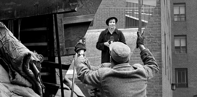
The source of light used in this picture is natural, coming from the sun, but is maybe diffused by clouds, as the picture isn’t really bright in specific places. But the light is directly above the where the photograph was taken, I know this because the light is directly hitting the top of the man’s hat in the picture, and creates some harsh and soft shadows below where his coat is ruffled.
In the bottom left corner of the image, the piles of cloth piled ontop of eachother create quite a rough texture.This is because the cloth looks like it needs to be ironed as it is crinkled, so it has quite sharp small shadows, creating the rough texture. I thought this was quite noticeable because the actual cloth is quite a light tone with lots of dark shadows, making them look like black lines. However this is contrasted with the texture of the mirror, because it has smooth edges and is very clean without any scratches or cracks on it. In the top left corner there is a large plank of wood, which looks like it would be a rough texture because in some areas of it, it looks like it got damp which creates dark and lighter patches on it. This makes it seem as though it’s quite rough from the streaks of darker tones. I noticed this after a while, because my attention was originally focused on the brightest and darkest parts to the photograph, and the wood isn’t either.The majority of this image is in focus apart from Maier herself who was in soft focus. I think this was because she didn’t want herself to be the main focus to this photograph, but what the man was doing and the mirror he was holding, to capture the moment, which creates quite an emotionless feeling because the man’s face is hidden by the angle of the photograph. As Maier is in soft focus, it makes her seem quite mysterious, adding onto the fact she is a reflection in a mirror.
The angle of this picture is at eye level looking straight ahead. This makes me feel as though Maier is looking into the man who is workings life.There are many lines formed in this image, but the one that stands out the most, are the diagonal lines from the edge of the mirror, which split up the image into three sections. This overlaps with the lines from planks of wood and metal framing. Repetitive lines are also formed from brick building, and the way the bricks are laid. Natural lines are also seen in the image from the tree branches in the background.I think Maier only included a small part of the pile of things he was loading, because she wanted to keep the focus of the image on him as well as the mirror, keeping them in the centre of the photo overall.
Experiment #1


This set of images were based around the two formal elements, light and tone. I took these images using an iPod around school, which is why the images are a little bit pixelated in some. In all of these pictures the lines were either natural, or man made, and all of the light source in the images were natural. My favourite image out of all of these, is the first picture, This is because a shadow from a door which isn't in the frame, created an M like shadow. I like this because you cant actually see where the shadow is created from, which makes it quite mysterious, as well as the fact that it is quite faint. In this photograph there is also a clear different in tone, from the patch of bright light on the wall, as well as the bright reflection from the metal pole. This is contrasted to the pitch black background from behind the wooden bench. To improve on these images, i would have tried taking more pictures that had a different light source, like a light bulb.
|
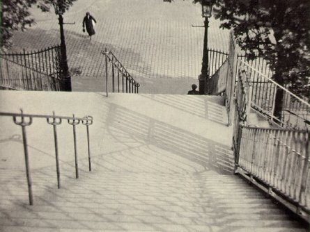
Andre KerteszOld photography (black and white).
Looking down a staircase. Person in background, use of perspective. Tones clear dark and light, a bit washed out. Lots of pattern used- parallel lines converged frequently, minute patterns from street, overlapping, geometric. |
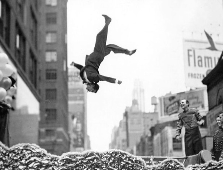
Garry WinorgrandThis is a photo montage, created probably by photoshopping different parts of images onto one picture, to create one photograph. The photographer took the original background image out of focus, so when he added new parts to it, they would stand out more, as they are all in focus, drawing our attention to them. One formal element seen in this image, is tone. There is a wide range of tones, but the majority of this picture is quite a light tone, so the dark tones from the roof of one of the buildings and the people’s clothes stand out more. There is a clear contrast of black and white from the bright clear sky.
|
|
|
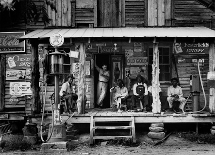
Dorothea Lange-Crossroads storeFirstly I can see a rough texture from each of the pillars/posts. They are a rough texture, because it looks like they are logs, with some of the wood peeling off, which creates a picture in my mind of getting splinters and cuts from swiping my hand down it. However this contrasts with the smooth plank of light wood, that runs across the bottom of the crossroad store. On the second level of the store the planks of wood have various dark and light patches in it. Even though the wood could be really smooth, because it has different tones in it, it creates the image of texture being rough. What strikes me most interesting about this photograph, is that the men blend in with the building, because none of them are in bold positions, and their clothes match the tones from the building.
|
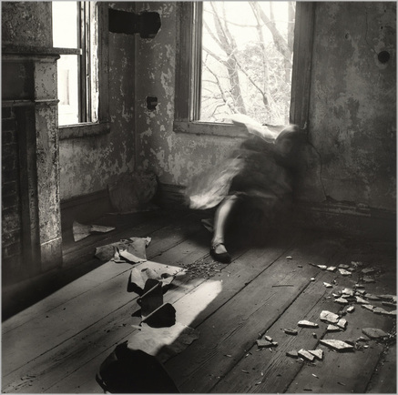
Francesca WoodmanThe source of light in this image, is natural as it is coming throughout the windows, from the sun. It looks very bright as the trees in the background are quite faint and the other window is nearly completely white. As well as this I know the sun is just above the main window because of the light patch on the floor created from the light shining through the window. There are many rough textures in the image, such as the peeling wall paper or paint and the rough texture on the floor from the different broken pieces of the ceiling or wall. This texture is contrasted with the smooth one created from the ghostly looking lady. When the photograph was taken I think she was moving, so that there would be a shadow of herself created, because on this she looks quite smooth as none of the body parts or textures on the cloth wrapped around her are defined. Furthermore, because the lady looks like this as well as adding to the fact she is on the floor, she kind of blends in with the wall, which makes her not very noticeable at first. I think this was to
|
|
make the photograph have a dark emotion and create quite an eerie atmosphere. The angle of this image looks like it has been take from an angle, and has been slightly tilted down, to show the woman is living. This can also be shown the the variating of lines in the image. For example the lines created by the floor boards which make the viewers eyes follow them, leading them to the lady, making her the focus of the photograph. Other lines are formed by the way the bricks are laid in the fireplace, which also creates a pattern.
Evaluation of an image without taking it
|
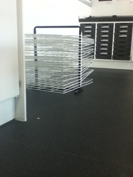
The image I can see includes 3 coulombs of dark grey draws which divides the picture into three sections, with white lines splitting them up. Overlapping the left row of draws is a white drying rack for art work, which also creates lots of overlapping lines. This is effective as it also shows the clear contrast in colours from the dark grey to the bright white. Where the white overlaps the grey, it lightens the colour up, showing more of a difference in the tones. The drying rack feels and looks like a rough texture, this is because of the thin strips of metal, making the grid form. Although if your hand down the line of draws it would be bumpy, because they are all exactly equal to each other they look smooth because of that. There is quite a lot of negative space from the large area of spoor space.
|
|
Experiment #2


I took these selections of images at home using an iPod, these were my five favourite images that I took. I am really pleased with all of these images, especially the ones with my hand in. This is because it clearly showed one of the formal elements i was focusing on, which was light. If i could change one thing about these images though, would be by changing the effects on the images, for example turning them into black and white to see if the light came through as clearly as it does in the originals. However i think it was the right decision not to change the effects on the second image above, because I really like all the different colours and shades that come though. As well as this, it already looks like i have added an effect as the colours really stand out by their brightness and distinction.
Experiment #3


For my experiment three, I walked around school looking for distinctive lines. One thing I like about the second and third image above, is that the lines in the image, split the photographs into three sections. I think this makes the image more interesting to look at, again in image four and five the lines from the staircase, split the image in half down the middle. By these clear divides in the picture, it contrasts each section to one another. One way i could have improved again, would be by changing the effects on the image, maybe by using B/W, as this could make the lines in the images even more distinctive.
