Camera-less Photography
Camera-less photography- creating a photo, without the use of a
camera.
Photogram- A picture produced with photographic materials (light
sensitive paper).
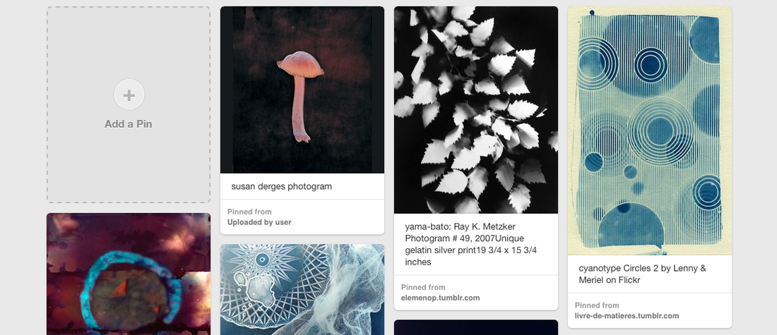
Photograms
|
|
|
|
|
|
|
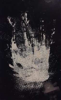
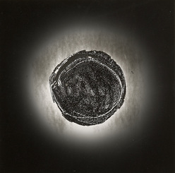
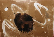
Ada Fuss was a English photographer, who started off by using a camera a to take photographs, which then led to him experimenting with conventional photographic processes. Eventually he gave up with cameras all together and focused on camera-less photography, specifically photograms. In lots of his photograms, he uses dolls dresses, but is best known for his photograms of water.
" A relentlessly intentive photographer, Fuss has made some of the most exciting, mysterious and provocative images of the past twenty years."- New Yorker. |
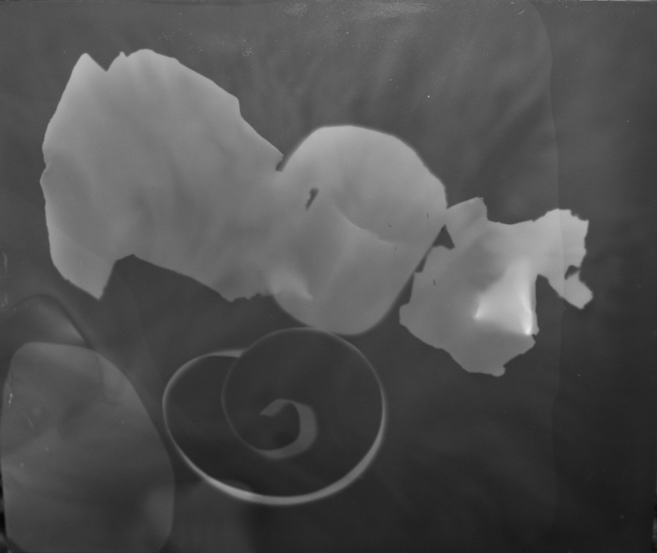
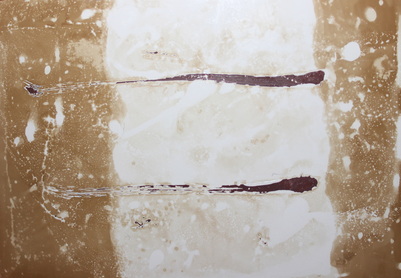
Experiment #1
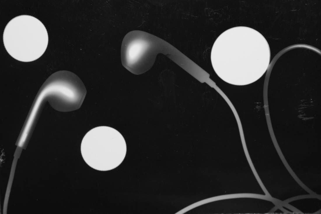
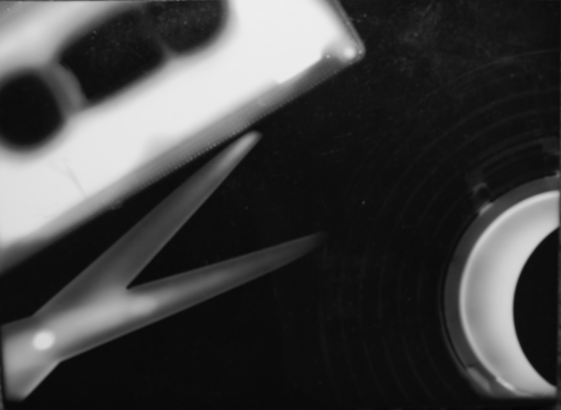
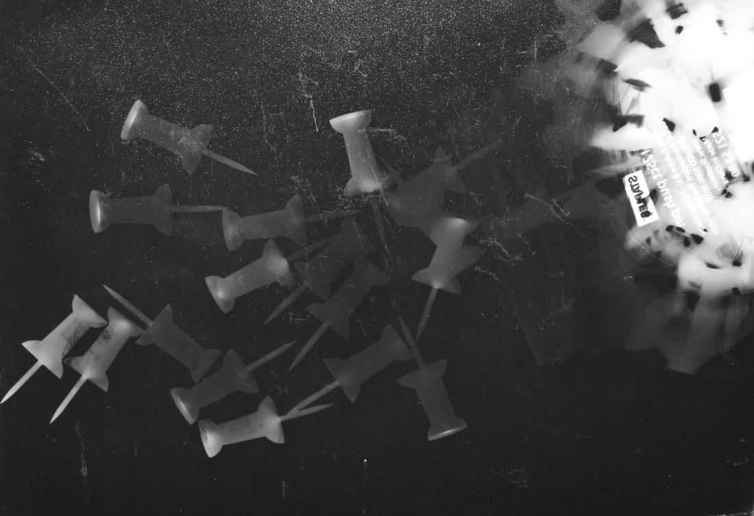
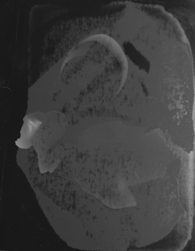
These were my first set of photograms which I created, using objects from around the classroom. The aperture on the enlarger used was near the highest, so i only exposed the paper for about 3 seconds, but it was a bit of a guess. However the pictures came out alright as there are clear differences between the brightest and darkest parts to these photograms. For my next photograms, I would like to use different objects and maybe try over exposing, or under exposing the paper, to see the different outcomes. Once I exposed the paper, I them put it into the developer for 2 minuets, then moved it into the stopper for 1 minuet, then finally placed it into the fixer for another 2 minuets. Afterwards I rinsed it with normal water and left it to dry.
Experiment #2
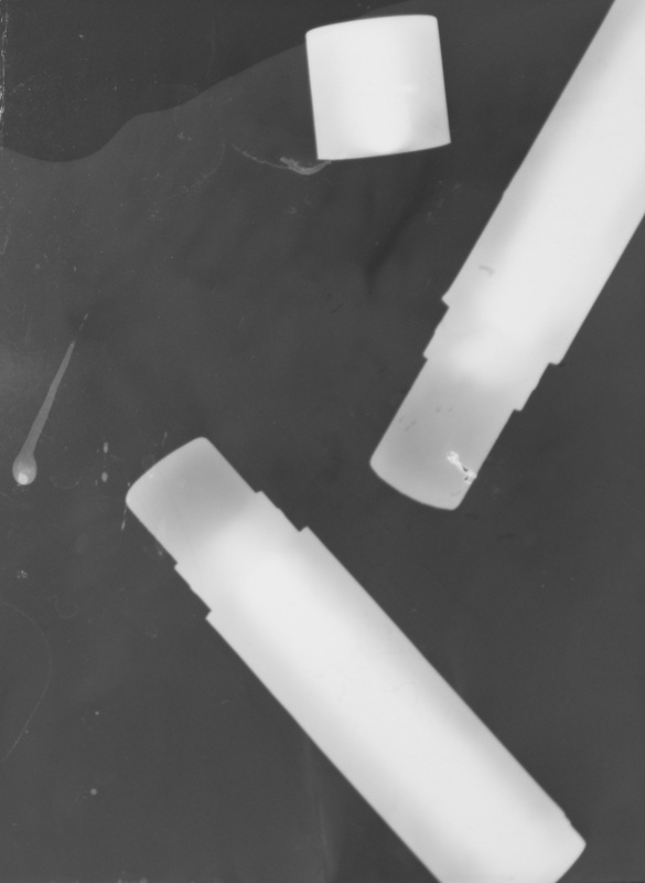
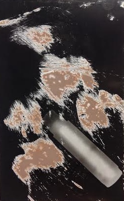
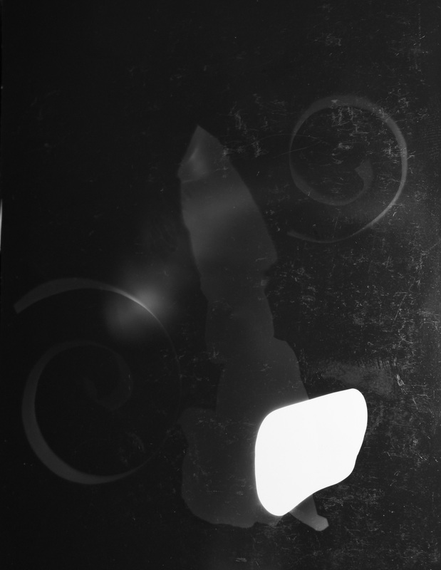
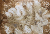
For this experiment, we had to create a set of photograms using objects from home. I decided to bring in a variety of lip balms I found around my house, including a mirror. The majority of these photograms I set it to the highest aperture and expose the photographic paper for 2-4 seconds. However for my photogram with the mirror, it didn't have the outcome I wanted it to have. I thought there would be more of a variation of tone, from the reflection of the mirror, which worked, but not as much as I was expecting. I then just started focusing on using the lip balms. But I wanted them to look more interesting, so I decided to spread the different lip balms on the actual photographic paper. For these images I used the highest aperture and exposed it for 5-6 seconds. Before developing the images I had to wipe off all the lip balm, so the chemicals wouldn't be effected by it. However once I looked at my photograms after they had dried, I think the leftover oil from the lip balms reacted with the chemicals and what was leftover, was a sticky pinky brown consistency. My favourite image is either the fourth or fifth one. I like the
Experiment #3
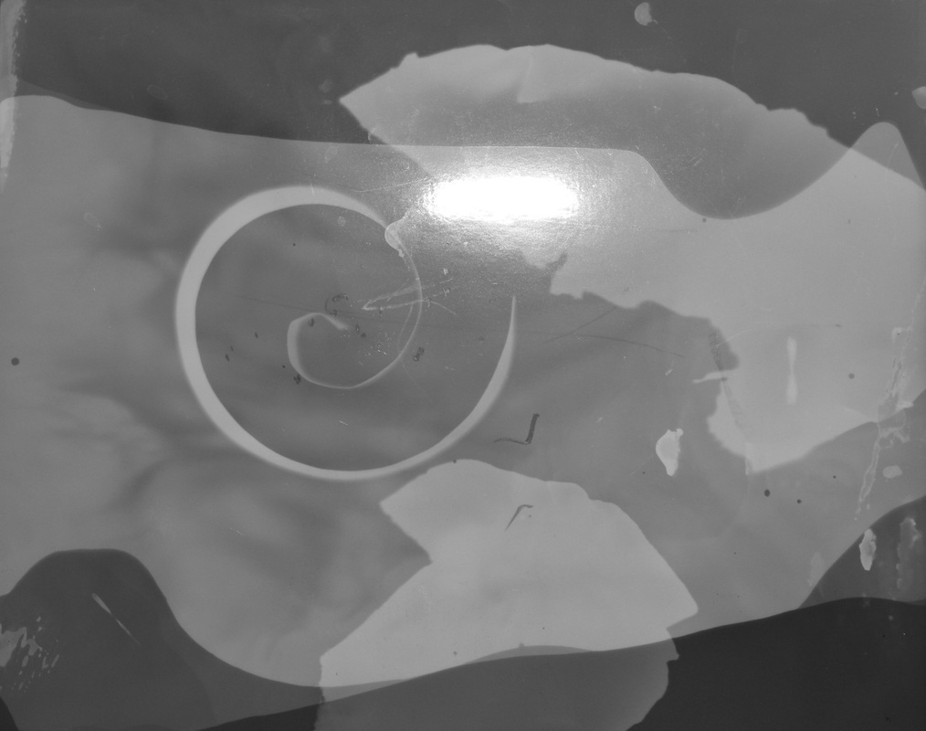
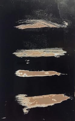
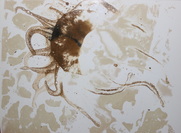
My third set of images were all focusing on paper, like Man Ray's photograms, so I didn't want to over complicate my images, so I tried to keep them simple, by only having a couple of small pieces of paper . I wanted to create a variation between the textures of the paper. For example I took a strip of paper and curled it up to get the smooth spiral which is compared to a rough texture from a piece of paper scrunched up then flattened out, because of this I think it makes the images more interesting to look at than just one piece of paper on its own. With each of these photograms I changed the aperture as well as the time they were exposed for. The first photogram was on the middle aperture, so I guessed to expose it for around 8 seconds. This came out under exposed as the image is quite dark so the textures of the paper wasn't coming through as well as I would have liked it to. My second try was on the highest aperture so I knew the paper shouldn't be exposed for too long, therefore I only left the light on for 3 seconds. The outcome of this photogram was a bit better than my first attempt, as the contrast in colours from the paper to back group came through slightly more. However it still would have benefitted from another second of being exposed. Finally I set the aperture to the lowest and exposed the image for 25 seconds. This was the most successful outcome out of the three photograms, as it wasn't under exposed but just a little bit over as the paper I used for objects came out quite bright. However I don't really know what happened to my last photogram, as it turned out looking like the majority of the image didn't develop well, even though I left it in there for 2 minuets. Over all I liked the process of making these images as not all of them came out the way I wanted but it showed my progress in guessing how long to expose each piece of photographic paper for.
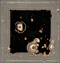
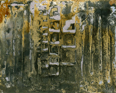
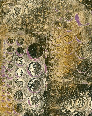
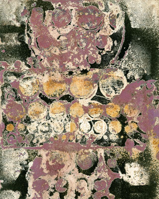
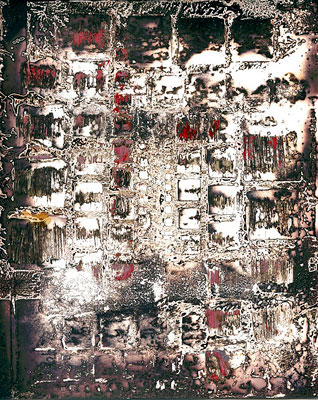
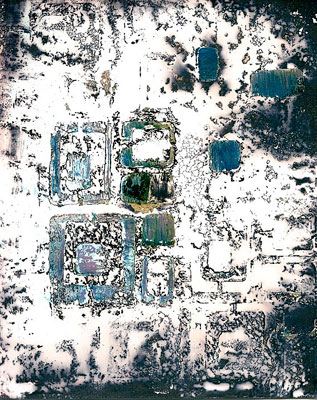
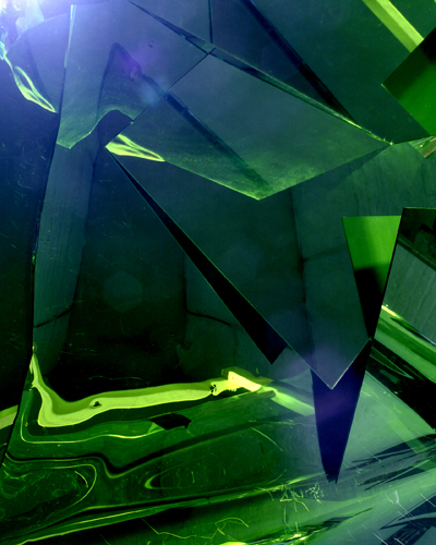
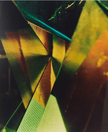
Chemigrams
Chemigram- Is an experimental art where a photograph is created by painting (oil, nail varnish, cream) on light-sensitive paper.
The result resembles a watercolour painting.
The result resembles a watercolour painting.
|
|
|
|
|
Experiment #1
|
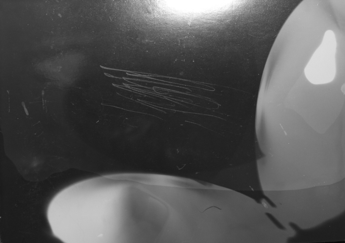
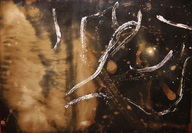
For my first set of chemigrams I used a variety of liquids to create these images, such as; Bleach, cream, flash, nail varnish, window cleaner and deodorant. As well as this I also experimented with the developer, stopper and fixer as I was only using specific ones for certain chemigrams. For example the very bright chemigram wasn't developed, as I wanted the extreme contrast between the background and the flash I sprayed on, and spread around using a straw. But if I developed it the background would go black depending how long I left it in there for. On my first chemigram it was produced in daylight so, I only put it into the developer and fixer, I did this so the image would keep changing colour after it had been fixed, to see the outcome. One thing I don't like about this image is, because of the deodorant I used, it didn't mix well with the developer and fixer, so it look like oil mixed with water on the top, so the actual texture of it has become rough not smooth. I really liked the final image because I like the gold colour that has come through. However to improve this set of images, I would have left the chemigrams in the developer, stopper and fixer if I used them, for longer as all the images have turned out with a muddy brown colour which I think could have been avoided, as I only left them in the trays for about 30 seconds each. In my next experiment, will try and make more chemigrams, but all in different types of light to see the how the colours come out, as only one was in day light and the rest in a dark room with all the blinds down.
|
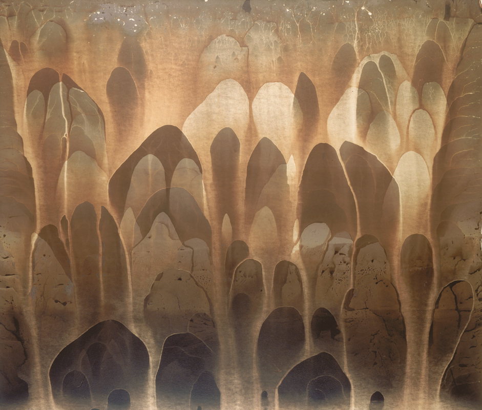
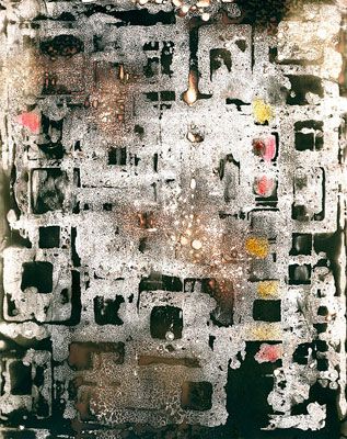
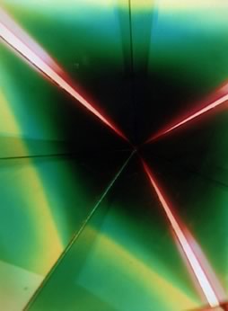
Cynthia Huber
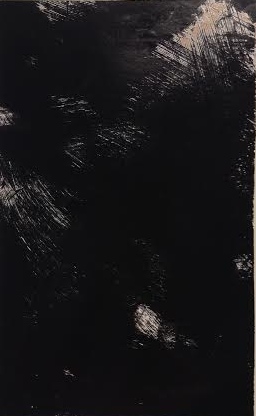
What I really like about Huber's work is that all of her chemigrams, look very complex and there is something to look at, in every part of the image. She created patters so as no point in the photograph is one plain colour. I would quite like to try and create chemigrams like this, by using the same materials and liquids she uses to create them. I think my favourite image of hers, s the last one, mainly because I like the colours she used in it white, Blue and yellow, when mixed made other colours. I like the square pattern she has created which are all different sizes. As the majority of the chemigram is white it makes the colours stand out more and it kind of looks like she used dark colouring around the edges, then used salt to soak it up, which left the small dark patches.
Developing Negatives
During class we were given a film camera in pairs and took around 15 images each. We developed these images in the dark room, by taking the single image film and placing it into the enlarger, so the picture was then projected onto the surface to be exposed onto the photographic paper. But before exposing it, I had to make sure the image was in focus, by zooming in and out of the image, to make sure it came out clear. As well as this we were given a variety of filters to put on top of the film, to make more of a contrast between black and white, instead of it coming out mainly grey and white.

|
Contact sheetHere is a contact sheet of all of the negatives that I took using a film camera. To create a contact sheet, I had to put all of the negatives into a frame which held them all in lines.
|
Here are a few of the images I took, I have included my favourite and least favourite ones. Overall I I really enjoyed the process of taking the photographs and developing the negatives, as it is something I have never done before and I would like to do again.
|
For this first image, I decided not to use any filters to see what the outcome would be like, because of this the image mainly came out grey apart from a few white parts. I exposed it for 5 seconds on the second to highest aperture which I think was the right amount of time, however I don't think I focused it completely as nothing was completely in focus. To improve I would try using filter 1 to get more of a difference in tone. |
|
|
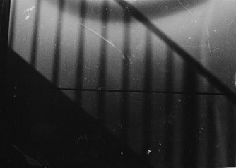
I really like this picture because it has more geometric shapes in it than my other ones, so there is more of a pattern created. I decided to use the filter 1.5, to get a bigger variety of tones, which worked well as there are black parts to the picture. I exposed it for 3 seconds on the highest aperture which was just about right, but maybe it was a little bit over exposed, because it is quite dark. |
|
|
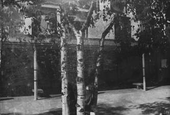
I decided to experiment more with the darker filters, so for this negative I applied the filter 4. This made the image look quite overexposed. However I think this was beneficial, as the main focus of the image were the trees and the lighter parts to the image highlight the tree bark. I decided to expose it for 2 seconds, to try and get it a little bit over exposed, to make the image even darker |
|
|
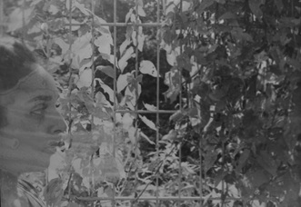
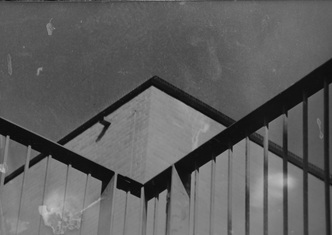
This is my least favourite negative because I set the image to focus on Yasmin, standing under the shadow from the links. But she is unnoticeable as I applied the filter 2 and slightly over exposed the image as I left it for 3 seconds. The only thing I do like about this picture is that because it is dark, it is harder to recognise what the shadow is created by, from the angle I took it at, it looks more like stairs. |
|
|
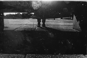
This is one of my favourite negatives I took, just because I experimented more with the angle I took the picture at. Because of this it makes me feel like it was taken from a viewpoint of a floor animal. I decided to use the filter 3, so there was a drastic difference of tones in the picture. I also experimented more with changing the aperture to the third highest and exposed it for 5 seconds, which was just about right. |
|
Handmade Negatives
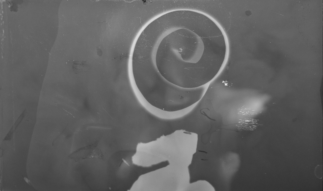
For my next experiment, I made handmade negatives in class using 2 thin plastic sheets of plastic, a small frame to hold the negative, food colouring and salt. On my first negative I only use different drops of food colourings. On my second try at making a negative we were allowed to use a straw to create patterns from the food colouring, so it . Finally for our last experiment with hand made negatives we put food colouring on one of the plastic sheets, then sprinkle a small pinch of salt on the plastic, so it soaks up most of the food colouring.
Eileen Quinlan
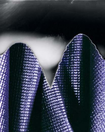
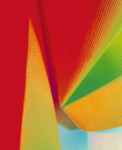
Eileen Quinlan is an American photographer. These sets of images were based around capturing the different fabrics and their colours. All of these images were took using an old polaroid camera, on some of the film she would snap it slightly, so the image wouldn't develop in some areas as you can see on the image of the purple fabric. In the majority of these pictures, she used a yoga mat and shaped it in different ways, as well as this she used a strobe light when capturing the image as a source of light. Some of her photographic subjects include,mirrors, smoke, coloured lights and other photographs among others.
I would class these images as photography rather than camera-less as Eileen Quinlan uses cameras, to capture the different materials and the light. She uses the different textures and lighting to manipulate the image, which overall makes it harder to tell that the image is of.
